Showing posts with label CR84FN. Show all posts

March 17, 2012

Card Patterns sketch #157--Sponsored by Sparkle Creations Rubber Stamps


Happy St. Patrick's Day, friends!  Do you have any plans to celebrate today?  Our kids already had a visit from the leprechauns and enjoyed some green pancakes for breakfast.

If you're planning to get crafty today, I hope you'll give the new sketch at Card Patterns a try!  This week we're sponsored by Sparkle Creations Rubber Stamps, who sent the Design Team some of their cute stamps to use on our designs.

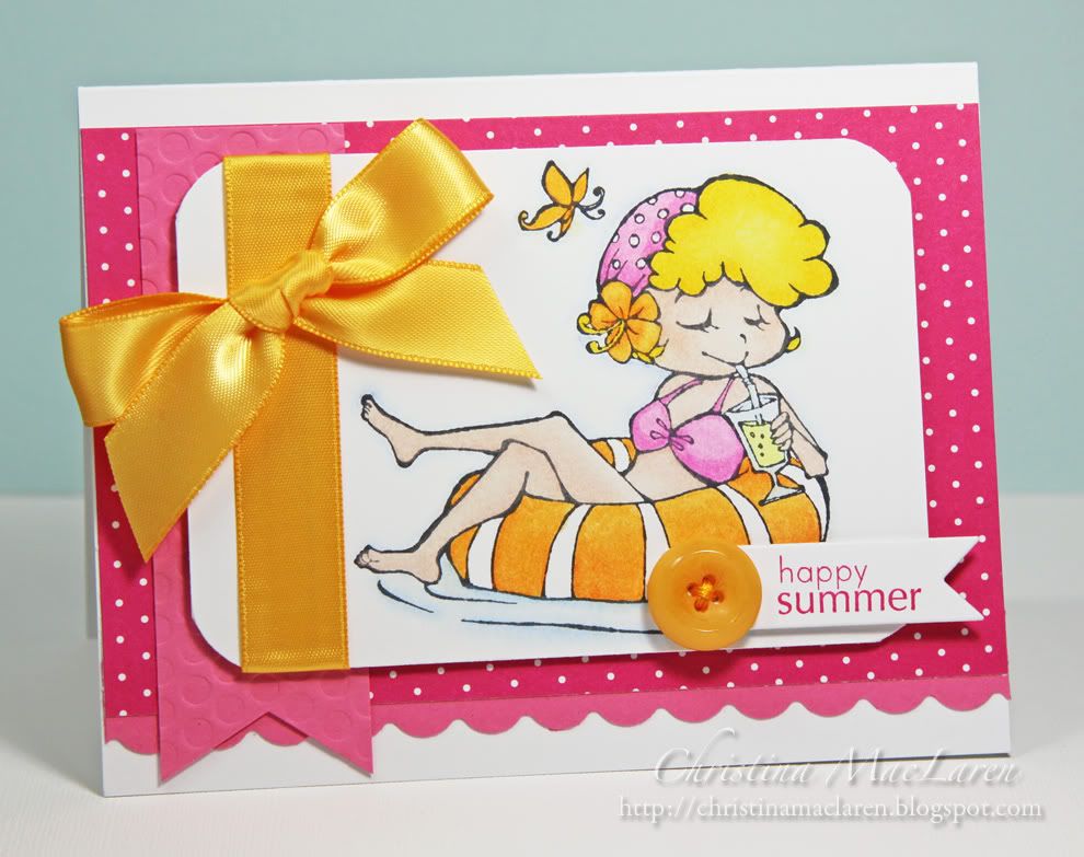
I also used the colors for the current CR84FN challenge.


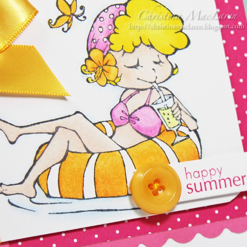
One of the images I was sent to work with was Swimming Lucy, which I thought would work perfectly with these bright colors.  It also explains the "Happy Summer" sentiment in March!

The image is colored with Prisma pencils and adhered to a base of Raspberry Fizz bitty dot patterned paper. 

Cardstock:  Papertrey Ink (Hibiscus Burst, White)
Patterned paper:  Papertrey Ink (2008 Bitty Dot Basics)
Stamps:  Sparkle Creations Rubber Stamps (Swimming Lucy), Papertrey Ink (Tag-its #4)
Ink:  Memento (Tuxedo Black), Stampin' Up! (Melon Mambo)
Tools:  Fiskars (scallop border punch), Papertrey Ink (polka dot impression plate, banner die), corner rounder
Accessories:  ribbon, button, DMC floss
Coloring medium:  Prismacolor Premier pencils

Stop by the Card Patterns blog today to check out the rest of the DT samples and link up your creation for a chance to win this week's prize!

I'm off to catch up on some chores around the house so that I can enjoy the nice weather we're supposed to get tomorrow.  Hope you enjoy your weekend!  Thanks for visiting today!

January 31, 2012

For Cath (sans CHA) with Love Blog Hop, CAS-ual Fridays #37, & CR84FN47


Hello, crafty peeps!  Are you ready for a mega-fun blog hop in honor of Miss Moxie Fab herself, Cath Edvalson?

The idea for this hop came from talented crafters Lorena Canto and Virginia Lu, and there are dozens of amazing designers participating!  Cath recently shared the news on the Moxie Fab World blog that she would be unable to attend CHA this year due to severe pain in her shoulder.  To wish her a speedy recovery and thank her for keeping us up-to-date on all things trendy, we're sending her well wishes with some creations just for her!


I was also inspired by the sketch this week at CAS-ual Fridays and the sweet colors at CR84FN.

One of my go-to sets lately has been PTI's Faux Ribbon.  I used it on this card to stamp rows of circles in Real Red, Regal Rose, and Pool Party.  I added a Pure Poppy felt flower with a button center and a Tiny Tag stamped with the sentiment "feel better".

The eyelet border is CASEd from my friend Karen Baker's design for CAS-ual Fridays this week--I knew it would be perfect with these circles.

The Aqua Mist panel is debossed with PTI's argyle impression plate, which I thought was a fun contrast to the circular elements.


All supplies from Papertrey Ink unless noted
Cardstock:  Aqua Mist, White
Stamps:  Faux Ribbon, Tiny Tags
Ink:  Real Red, Regal Rose, Pool Party (Stampin' Up!), Versamark (Tsukineko)
Tools:  Argyle impression plate, Tiny Tags die, Beautiful Blooms dies, Eyelet border die
Accessories:  Pure Poppy felt, Aqua Mist button, DMC floss, thread

To see the rest of the cards on the hop, all you need to do is stop by Lorena Canto's or Virginia Lu's blog for links to the participants.

We hope you're back in tip-top shape very soon, Cath!  Best wishes to you for a speedy recovery!

December 1, 2011

CR84FN43


Hello again!  Thanks for all of your well wishes yesterday.  The kiddos are much better today, and I'm starting to get my voice back.  I think an afternoon nap today should have us all feeling as good as new!

Today's card is one I made for my hubby's birthday, which was yesterday.  His favorite color is green, and he likes any earthy tones, so this week's CR84FN color palette was a perfect fit.


My hubs is not a big fan of white space.  He's stopped saying so directly, but every time I show him a clean and simple card I can hear the voice in his head saying "Why don't you put something there, in that empty space?"   So I knew that his card shouldn't be too CAS, but who can resist a bit of white space?  Certainly not me!

I think this card is my CAS version of a collage.  I always admire crafters, especially scrapbookers, who can execute a perfectly balanced but seemingly random arrangement of elements.  I long to be that scrapbooker, but my attempts always wind up looking, well, random.  I think I found a happy medium on this card.  Not too busy, but just enough elements to keep it interesting, with an empty space where the eye can rest.
Stamps are from PTI's Postmarks and Star Prints.  I used the Linen & Canvas impression plate to add a worn look to the kraft panel, and PTI's star dies to make the star frame.

All supplies from Papertrey Ink unless noted
Cardstock:  Pinefeather, Kraft, Rustic Cream
Stamps:  Postmarks, Star Prints
Ink:  Vintage Cream, Chocolate Chip (Stampin' Up!), Evergreen (Clearsnap)
Tools:  star dies, postage die, Linen & Canvas impression plate

So what did hubby think of his card?  He said he really liked it, especially the green, but he thought the sentiment should read "First Class MALE".  *snort*

I hope you have a great day, friends!  Thanks for your visit!

October 12, 2011

Carbon Copied & CR84FN40


Hello out there!  You're in for a special treat this morning.  I am absolutely thrilled to be posting alongside my friend Karen Baker from The Bald Dragonfly as her guest for Carbon Copied.  This is a fun little feature on Karen's blog where she and another designer use the same stamp set and same challenge, then post their creations at the same time.  You can read more about it HERE.  

Karen and I decided to use a favorite pair of stamp sets, WPlus9's Woodgrain Silhouettes and Additions, along with the color challenge at CR84FN.


I used just Woodgrain Silhouettes to create my CAS card, as well as a couple of other WPlus9 goodies.  First I used the Label Layers 3 die to mask and stamp a woodgrain frame onto kraft cardstock.  A gorgeous sentiment from Very Vintage Greetings was stamped directly on top of that, then the panel was debossed with PTI's Linen & Canvas impression plate.

I stamped the flowers (from Woodgrain Silhouettes) onto cream cardstock and cut them out by hand, then adhered them with foam dots.  A few red pearls and a red satin bow add a punch of color.

Cardstock:  Papertrey Ink (Kraft, Vintage Cream, Dark Chocolate)
Stamps:  WPlus9 Design Studio (Woodgrain Silhouettes, Very Vintage Greetings)
Ink:  Stampin' Up! (Chocolate Chip), Papertrey Ink (Dark Chocolate)
Tools:  Papertrey Ink (Linen & Canvas impression plate)
Accessories:  Papertrey Ink (ribbon), Queen & Co. (pearls)

I can't wait to see what Karen has created with the same stamps and color combo--it is sure to be inspiring!  Make sure you hop over and leave her some love.

Thanks for inviting me to play along this week, Karen!  And thanks to everyone else for stopping by today!

October 7, 2011

Operation Julie's Smile, CR84FN39, & Textured to Perfection


Happy Friday, friends!  I'm thrilled today to be participating in a special blog hop for the sweet and talented Julie Ranae.  If you are following along on the hop, you should have arrived here from 
the blog of Vera Yates.  If not, make sure you stop by the Sweet Stamp Shop blog to start at the beginning and learn how you can win some fabulous prizes while helping a fellow stamper.  

There are over 120 blogs participating in this hop, so if you encounter a broken link at any time, just head back to the Sweet Stamp Shop blog for the full list of participants.  You have all weekend to visit and comment, so take your time and have fun!

Please keep reading to learn more about Julie's story and how you can help give her back her smile!

“The creative blogging community is coming together this weekend to help one of our friends, Julie Ranae.  You may know her as the Design Team Coordinator for many wonderful companies from bakers twine, die cuts, rubber stamps and more.  What many people don’t know about Julie Ranae is that she has had some pretty major dental surgeries in her lifetime due to medication she had to take as a child.  It was in her plans to think about having all of her teeth  replaced at some point in the next 5 years, a decision that was pretty easy to plan out.  But then it happened…she chipped her front teeth on a weekend a month ago. The dentist told her there was no way to save them & that it was his recommendation that she give in and have them all her teeth removed soon, but for that day, they needed to get her front teeth done so her gums could begin to heal. He said he would 'work out payments with her to have ALL this work done...but when she called to make her appt for the first step of impressions, they told her the amount of money that was needed and that the 'payments' applied only to the two teeth that were extracted that day. Her husband Paul was with her & that too, was his understanding as well. So this is how she has found herself in this situation…Needing at least $4000 to get started and another $3000 to finish the process…a total of $7000.

Nicole Rixon, owner of Sweet Stamp Shop put together this benefit after finding out about this situation and before Julie Ranae knew it, it took flight!
Because she is an event organizer by trade, she has taken on the job of organizing all of the blogs in this hop as her way of ‘working overtime’ for what she needs, the same as if she were able to work overtime at an outside job to pay for the work to be done.
It is the goal of all of these generous friends & sponsors to help make this situation more do-able for our friend so that she can share a brand new smile with all of us soon.


If there is anything you can do to help with a financial donation, there is a donation button ready for you to click.  Any amount is appreciated and ALL DONATIONS will be eligible for prizes from our sponsor pool of over $2500.”

You can find the donation button on my blog's sidebar, and on all of the other blogs along the hop.

Now to share the card I've made for today, with Julie in mind. 


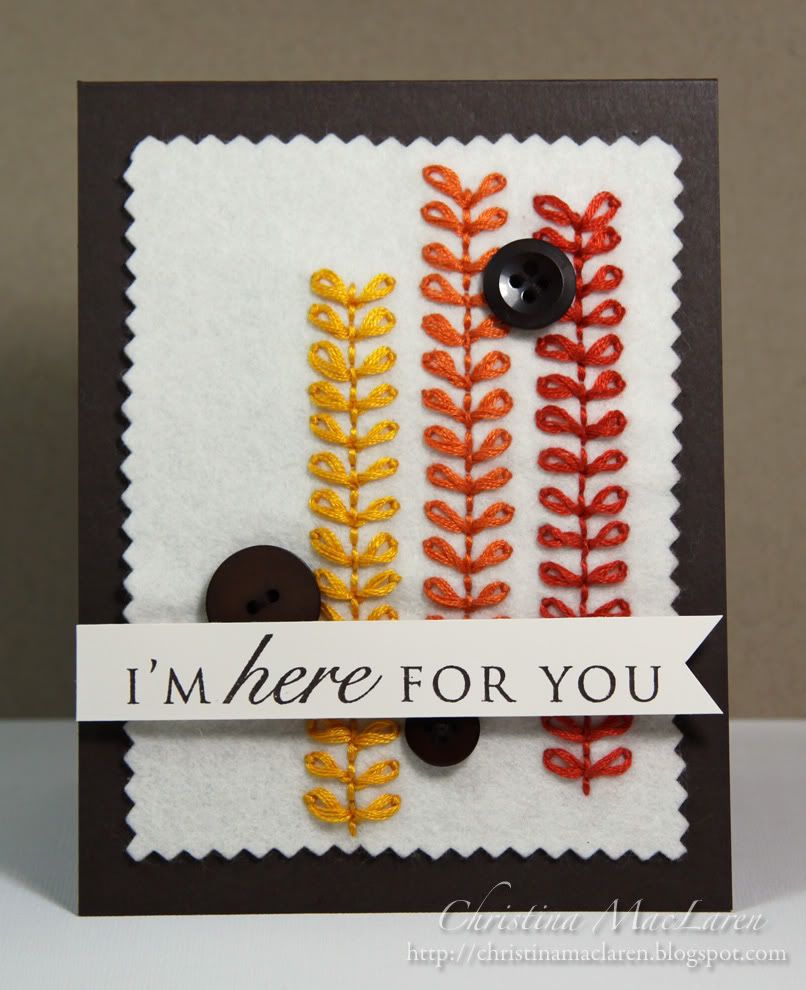
I combined the colors of the current CR84FN challenge with the Textured to Perfection challenge in the Moxie Fab World to create a fall-inspired card of encouragement.


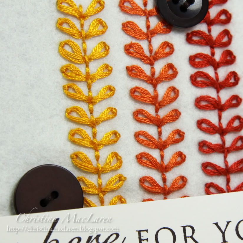
I cut a piece of cream felt with pinking shears and embroidered vines in two shades of orange (although one looks red in the photos) and yellow.  This was adhered to an Early Espresso card base and embellished with buttons.

I stamped a sentiment from PTI's Think Big Favorites onto a strip of Vintage Cream cardstock, notched one end, and adhered it with foam dots.

Cardstock:  Stampin' Up! (Early Espresso), Papertrey Ink (Vintage Cream)
Stamps:  Papertrey Ink (Think Big Favorites #4)
Ink:  Stampin' Up! (Early Espresso)
Accessories:  Papertrey Ink (felt, buttons), DMC floss

I'm so glad you stopped by today for this special post!  Your next stop on the hop is Carisa Zglobicki.  Don't forget to leave a comment here before you go for a chance to win prizes, and please click on the donation button to help our friend, Julie.

Have a great weekend!

September 4, 2011

CR84FN37 & JUGS #100


Hello there, friends!  Sorry it's been quiet around here this week, but I'm finally back with a card for a couple of challenges.  The first is the color challenge at CR84FN which includes some lovely shades of blue plus a neutral.  The second started out with the 100th sketch at Just Us Girls, but after I'd finished it I realized I left out the horizontal strips behind the oval.  Oops!  Still, I thought I'd link it up to help them celebrate their milestone!


The idea for this card came because I wanted to send a card to my sweet friend Andrea, who is currently on her way across the country to her new home on Prince Edward Island.  She is a member of the design teams for CR84FN and JUGS, so I thought it would be fun to combine these two challenges to make a card for her.

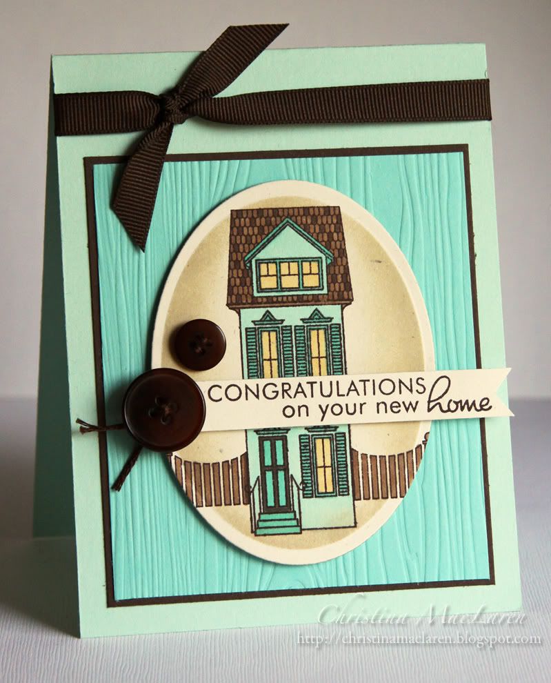
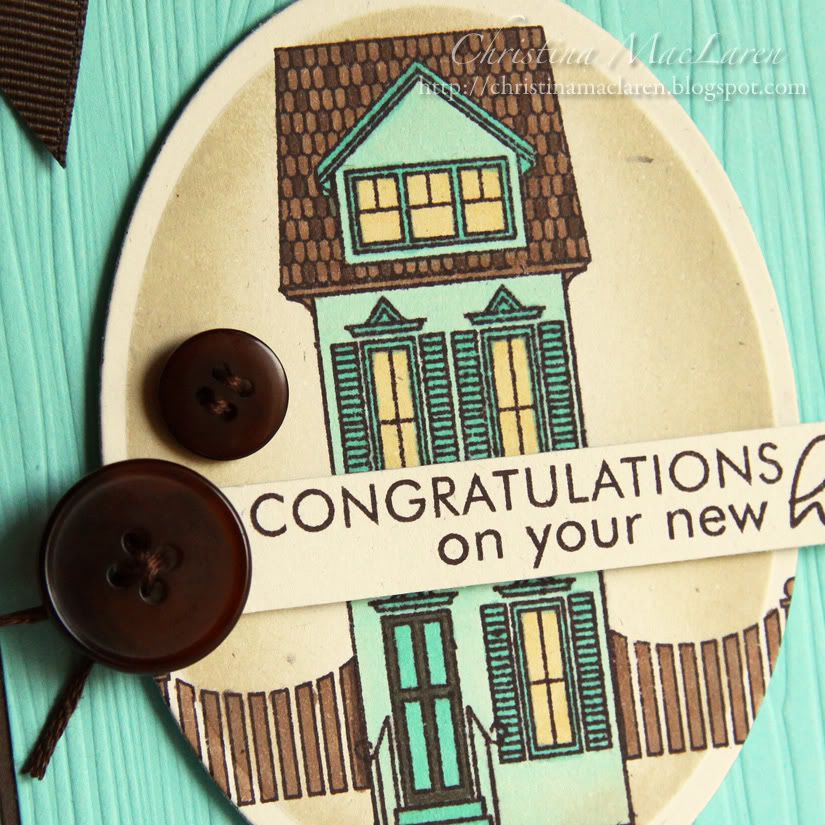
The house and sentiment come from PTI's Boards & Beams colored with Copics.  I inked the oval Nestie with tea dye, then adhered it with foam dots to a Hawaiian Shores panel debossed with the Woodgrain impression plate.  A brown ribbon and buttons add the finishing touches.

Cardstock:  Papertrey Ink (Aqua Mist, Hawaiian Shores, Rustic White, Dark Chocolate)
Stamps:  Papertrey Ink (Boards & Beams)
Ink:  Stampin' Up! (Chocolate Chip), Papertrey Ink (Tea Dye duo), Copic markers
Tools:  Spellbinders (oval die), Papertrey Ink (Woodgrain impression plate)
Accessories:  Papertrey Ink (buttons), ribbon, DMC floss

I hope my American and Canadian friends are enjoying a long Labor Day weekend!  I'm currently visiting my FIL in Maine and hope to have a chance to go sailing tomorrow morning before we head home.
Thanks for stopping by tonight!  Have a good one!

August 12, 2011

CR84FN35, CAS-ual Fridays 15, & FTL 153


Good evening, folks!  I'm barely squeezing in a card for the color challenge at CR84FN!  I combined these lovely hues with the sketch at Clean & Simple Stamping, which has teamed up this week with CAS-ual Fridays.  What a great sketch!


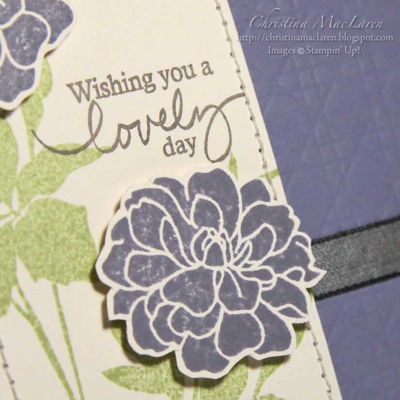
I inked up my new set from Stampin' Up! called Fabulous Florets with Certainly Celery and Wisteria Wonder.  I was very excited to see this beautiful shade of lavender as one of the new In Colors.  

The flowers were easy to fussy cut and pop up for dimension.  I stamped a sentiment from PTI's Signature Series:  Butterfly in gray and stitched around the edge of the panel.

The card base is Wisteria Wonder debossed with PTI's Cane Print impression plate, which is already a new favorite of mine!  I added some Basic Gray ribbon in place of the horizontal strip on the main panel in the sketch.

All supplies from Stampin' Up! unless noted
Cardstock:  Wisteria Wonder, Vintage Cream (Papertrey Ink)
Stamps:  Fabulous Florets, Signature Series:  Butterfly (Papertrey Ink)
Ink:  Certainly Celery, Wisteria Wonder, Antique Pewter (Clearsnap)
Tools:  Cane Print impression plate (Papertrey Ink), corner rounder
Accessories:  Basic Gray ribbon, thread

I'm off to link this up before the challenge expires at CR84FN, but you still have plenty of time to play with the sketch!  Thanks for stopping by tonight!

July 9, 2011

JUGS #92 & CR84FN #33


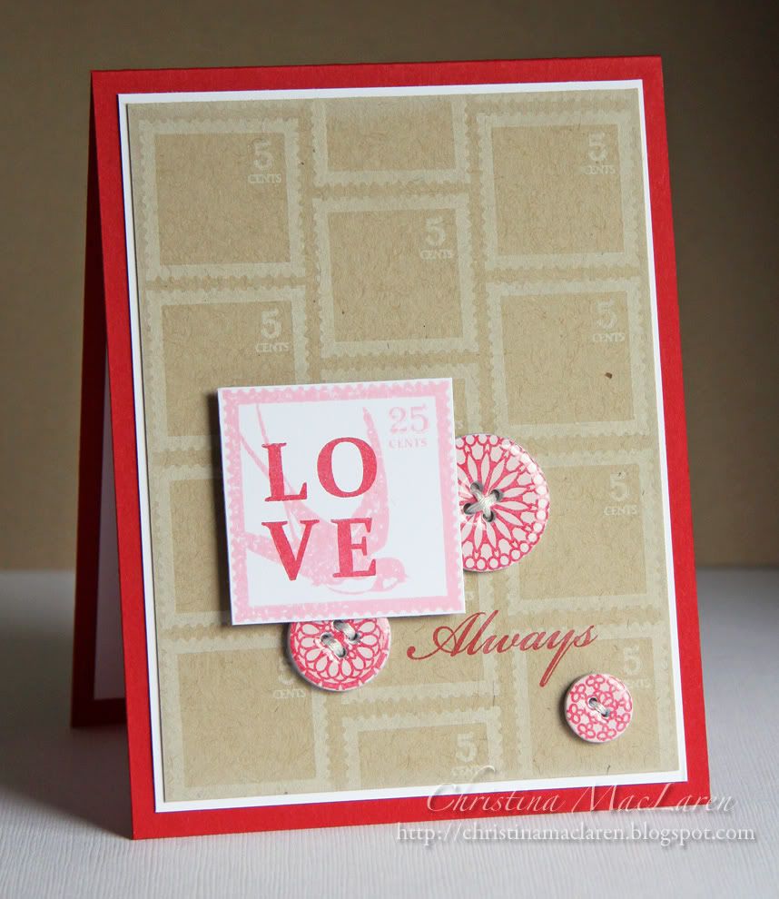
Hello, friends!  I'm so glad to be back for another week as Guest Designer with Just Us Girls!  This week Kristin has challenged us with a fun technique--making cardstock buttons!  There's a great tutorial for this technique HERE.  I chose to use the challenge colors at CR84FN as well, with kraft as my neutral.

ETA:  Check out this wonderful tutorial by JUGS Designer Dana at Want2Scrap!


The idea for this card started with the buttons, which I made using Papertrey's button dies, although you can make yours with any shape of die or punch you want.  Each button has 5 layers of cardstock to give it a nice thickness.  On the top layer of white cardstock, I stamped an image from WPlus9's Mehndi Medallions.  I can't tell you how much I love how this turned out!  A coat of Glossy Accents and these babies look almost like the real thing!

For the rest of the card, I stamped images from WPlus9's Spring Post, including the letters L-O-V-E over the bird postage stamp.  

Cardstock:  Papertrey Ink (Kraft, Pure Poppy, white)
Stamps:  WPlus9 Design Studio (Spring Post, Mehndi Medallions)
Ink:  Clearsnap (Frost White, Cranberry), Stampin' Up! (Pretty in Pink)
Tools:  Papertrey Ink (button dies)
Accessories:  DMC floss

Another sweet card for my sweet hubby.  I don't think he'll mind the pink, do you?  *grin*

I hope you'll give this technique a try and share your creation with us at JUGS!

Thanks for stopping by!

June 22, 2011

CR84FN32 & Card Patterns 120


Hello friends!  It's a rainy day here, so I turned to the current color challenge at CR84FN for a little sunshine!  These fresh colors are paired up with this week's sketch at Card Patterns.


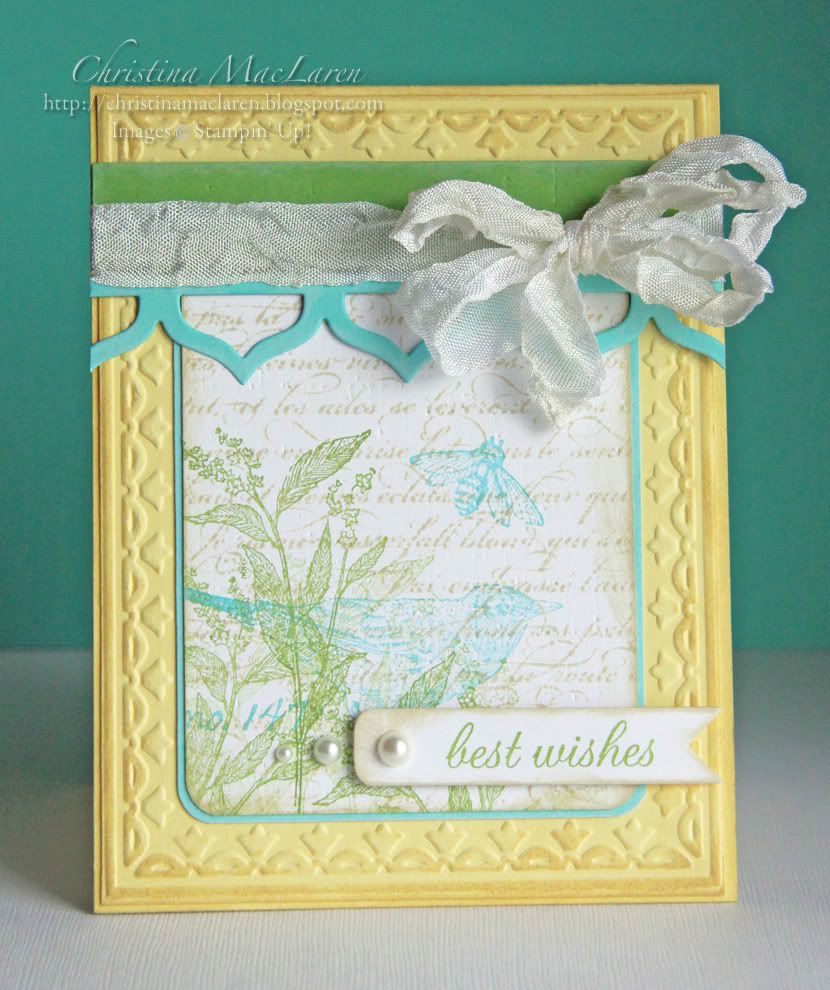
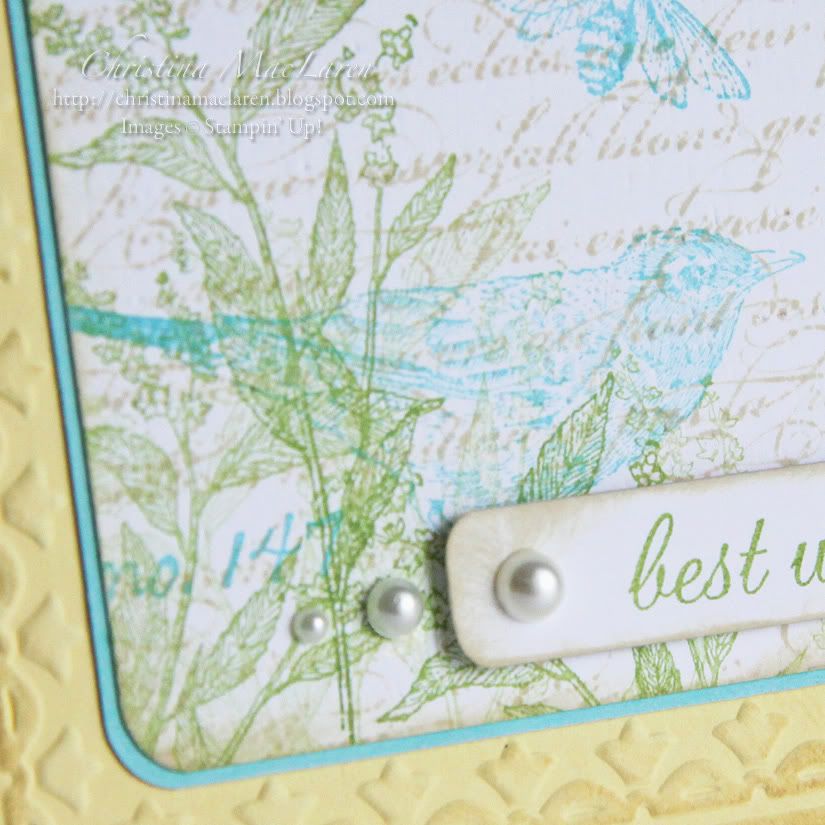
I've been doing a lot of CAS cards lately, so I felt like going a tiny bit shabby on this one.  I used several stamps from SU's Nature Walk to create a little botanical collage on white cardstock, then stamped French script over the top with Ranger's Antique Linen Distress Ink.  I used PTI's Linen & Canvas impression plate to add some texture to the panel before matting it with Hawaiian shores cardstock.

On the card base is a Lemon Tart panel embossed with Framed Tulips, a gift from my sweet friend Nance.  I added a strip of New Leaf cardstock and a Hawaiian Shores border cut with PTI's Victorian Lace border die.  The wrinkled ribbon was originally white, but I sponged it with Distress Ink to match the sponging on the rest of the card.

For the sentiment, I stamped "best wishes" from PTI's Mat Stack 2 Collection onto a banner, then added a few pearls as accents.

Cardstock:  Papertrey Ink (Lemon Tart, Hawaiian Shores, New Leaf, white)
Stamps:  Stampin' Up! (Nature Walk, En Francais), Papertrey Ink (Mat Stack 2 Collection)
Ink:  Papertrey Ink (Hawaiian Shores), Studio G (green), Ranger (Antique Linen)
Tools:  Stampin' Up! (Framed Tulips embossing folder), Papertrey Ink (Victorian Lace Border die, Double Ended Banner die, Linen & Canvas impression plate), We R Memory Keepers (Corner Chomper)
Accessories:  Michaels (pearls), Prairie Bird Boutique (wrinkle ribbon)

This card will be going out in the mail to a friend who's embarking on a new adventure soon.  Love when I can have a recipient in mind as I create.

Thanks for your visit today!  I hope the sun is shining wherever you are.  Have a good one!

June 9, 2011

JUGS87 & CR84FN31


Hey there!  I have a super quick post to share before I head to bed.  I combined the sketch from Just Us Girls (although I just discovered that the linky expired a few hours ago) with some gorgeous soft colors for this week's CR84FN challenge.


This card was made with my friend Andrea in mind.  She is on the DT for both of these challenge blogs, and she is celebrating her birthday this week.  Not only that, but I received some happy mail from her today in the form of a gorgeous card using PTI's Delightful Dahlia.  So Andrea, this one's for you!

I did some masking to stamp the large dahlia three times in one corner of my Vintage Cream cardstock using SU's Regal Rose ink.  I spritzed the image with Pink Pirouette and Wild Wasabi ink mixed with a little bit of Perfect Pearls for sparkle.  I then stamped a sentiment from PTI's Signature Greetings, added a bit of bling, and adhered the panel to a Wild Wasabi card base.

Cardstock:  Papertrey Ink (Vintage Cream), Stampin' Up! (Wild Wasabi)
Stamps:  Papertrey Ink (Delightful Dahlia, Signature Greetings)
Ink:  Stampin' Up! (Regal Rose, Pink Pirouette, Wild Wasabi)
Accessories:  Michaels (rhinestones), Ranger (Perfect Pearls)

Time to get some sleep!  Thanks so much for sharing part of your day with me, friends!
Related Posts Plugin for WordPress, Blogger...