August 30, 2011

ColourQ #100 & FTL #155


Good morning, friends!  

Today I have a very special ColourQ challenge to share with you!  This is the 100th challenge at the ColourQ blog, so we're teaming up this week with clean&simple stamping for twice the fun.  This week's challenge is to use Fall-to-Layout #155 with your favorite past ColourQ combo.  You can see all of the previous color palettes on one handy-dandy page HERE, or use the link on the ColourQ blog home page.

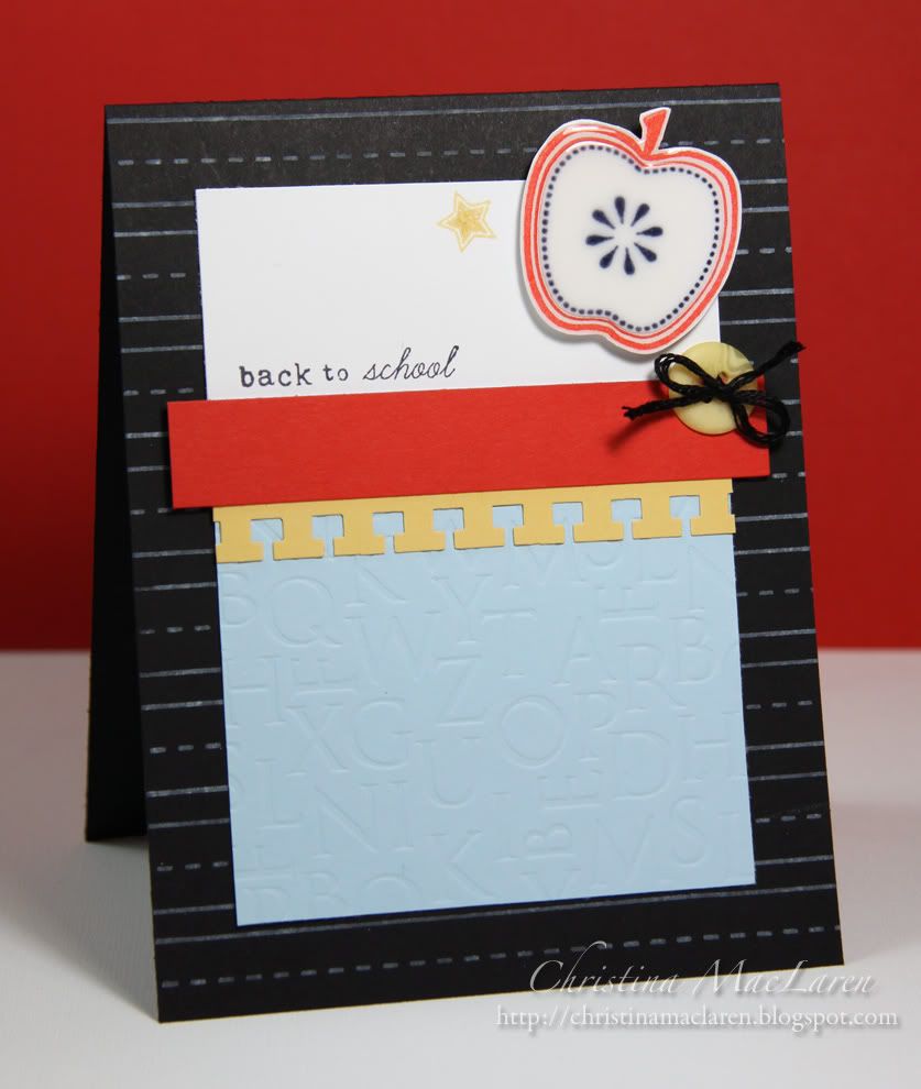
Ready to get crafty?  I chose cQc #44 for this challenge, because I needed to make a back-to-school card and thought the primary colors would work well.


I started out by making a chalkboard background, stamping lines from PTI's Scrapbook Series:  Library Ledger in white onto a black card base.

I debossed a Bashful Blue cardstock panel with the Book Print impression plate, then added a Saffron border punched with a notebook edge and a strip of Poppy Parade cardstock.

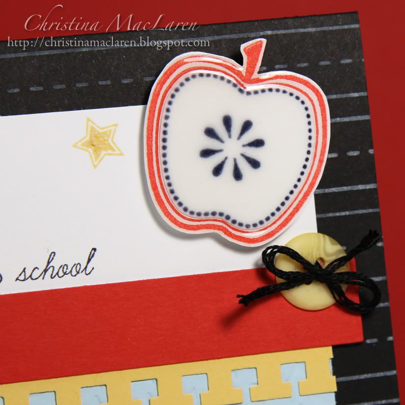
The apple stamp was a $1 find at Michaels over a year ago.  I stamped it once in red, once in black, then cut out the center of the black apple to layer on top of the red.  I gave it a layer of Glossy Accents for shine.

The sentiment and star are from PTI's Tag-its #6, and I added a bit of sparkle to the star with a clear Spica glitter pen.

Cardstock:  Stampin' Up! (Bashful Blue, So Saffron, Poppy Parade), Papertrey Ink (True Black, white)
Stamps:  Papertrey Ink (Scrapbook Series:  Library Ledger, Tag-its #6), Studio G (apple)
Ink:  Stampin' Up! (So Saffron), Clearsnap (Frost White, Scarlet), Inkadinkadoo (Black)
Tools:  Papertrey Ink (Book Print impression plate), EK Success (border punch)
Accessories:  Papertrey Ink (button), Ranger (Glossy Accents), Spica (glitter pen), DMC floss

There you have it--a CAS card to go in my daughter's backpack on the first day of school, which happens to be tomorrow.

I can't wait to see the variety of color combos in the gallery this week!  Be sure to check out the creations by the rest of the Royal Court Design Team, and you can find even more inspiration this week at the clean&simple stamping blog.

Thanks for your visit today!  Have a good one!

August 28, 2011

Color Throwdown #156 & Square Sketch Challenge


Well hello, strangers!  Can you believe I'm actually back with a card today?

As you might remember, I went back to work last week after spending the last 6 years at home with my kids.  It's a part-time job, but I was still exhausted every afternoon last week while adjusting to the new routine.  I am the new lab technician for the Health Sciences department at a local college, and I am loving the job so far!  I have a lot of flexibility and independence, which works perfectly for me and allows my hubby and I to coordinate our schedules so that one of us can still be home with the kids when they are not in school.  I feel so fortunate to be back at work doing something I enjoy after such a long hiatus.  Thanks to everyone for leaving your words of encouragement, and for your patience during my absence over the last week!

To get back into the crafty swing of things, I decided to use some lovely colors from The Color Throwdown with the Square Sketch Challenge in Card Ideas Week in the Moxie Fab World.


This is the first time I've played with PTI's Mehndi Medallions stamps and impression plate.  Oh my loveliness!  I just adore the highly detailed impression this plate leaves!  *swoon*

I also took inspiration from Maile Belle's interpretation of the sketch as seen in the challenge post.  I layered a hand-cut Plum medallion over the impressed cardstock, then gave it a Saffron center by stamping the medallion onto Saffron cardstock with Versamark, heat embossing with clear powder, and punching out the center with a 1 inch circle punch.

The sentiment banner was cut with PTI's Double Ended Banner die and stamped with a sentiment from Birthday Basics.

I thought about adding some scattered bling or glitter pen details, but I really like the simple elegance of the medallions as is.

Cardstock:  Stampin' Up! (Perfect Plum, So Saffron), Papertrey Ink (Kraft, white)
Stamps:  Papertrey Ink (Mehndi Medallions, Birthday Basics)
Ink:  Stampin' Up! (Perfect Plum), Versamark
Tools:  Papertrey Ink (Mehndi Medallion impression plate, Double Ended Banner die), Martha Stewart Crafts (circle punch)
Accessories:  Stampendous (clear embossing powder)

In other news, we are in the midst of Tropical Storm Irene right now (recently downgraded from a hurricane), but the rain and wind have been manageable here.  My thoughts are with those along the East Coast where the impact of the storm has been much greater, and where flooding continues to be a threat.  Stay safe, friends!

See you back here soon!  Thanks for stopping by!

August 24, 2011

Card Ideas for Paper Crafters--Horizontal Sketch Challenge


Did you happen to see this card today over in the Moxie Fab World?  Well, my friends, I just about fell out of my chair when I saw it!  That's my first Paper Crafts publication!!

I'm so excited to be able to share this card with you, and Cath made it even sweeter today by featuring it as part of today's horizontal sketch challenge.  I do hope you'll play along with this sketch--I love seeing so many different ideas using the same design!

I hope to be back with something new very soon, but for today I think I'll just bask in my 15 minutes of fame.  Thanks for indulging me!

Have a great day!

August 23, 2011

ColourQ #99


Hello, friends!

I'm just popping in to share this week's challenge colors at the ColourQ!  I'm taking this week off while I adjust to my new schedule at work, but I will definitely be back next week for our 100th challenge!

Be sure to stop by the ColourQ blog to see what the rest of the team has created with these fun colors, then link up your entry!

I hope to be back in the crafty swing of things by next week.  Thanks for checking in!

Have a great day!

August 21, 2011

Tuesday Trigger: Girly & Gutsy


Hello, crafty friends!  It's been far too long!  Last week kept me busy with training at my new job and a trip to the mountains in NH.  The summer days seem to be disappearing fast!

I haven't been in my craft space for almost a week, so this card took a lot longer than it should have.  The inspiration is the current Tuesday Trigger photo:


I think my card leans more toward the "girly" rather than the "gutsy", but I like how it turned out.  I was drawn to the clean black lines of the table, the graceful crystalline light fixtures, and the pops of yellow-green in the chairs.

I started with a Sweet Blush panel stamped repeatedly with a chandelier from Prima's Cantaria set using Versamark Frost, which gives it a hint of shimmer.  On the white cardstock below, I tried stamping leaves to mimic the rug in the photo, but it didn't go well with the design, so I opted for a damask image from the Prima set.  A strip of black cardstock and a Spring Moss scalloped border reflect the table and chairs in the photo.

The sentiment, from PTI's Birthday Basics, is stamped on a die cut Mat Stack 2 with the coordinating frame.  Finally, some iridescent gems play off of the crystal in the wall sconces and chandelier in the photo.

Cardstock:  Papertrey Ink (Sweet Blush, Spring Moss, True Black, white)
Stamps:  Prima (Cantaria), Papertrey Ink (Mat Stack 2 Collection, Birthday Basics)
Ink:  Inkadinkadoo (Black), Versamark Frost
Tools:  Papertrey Ink (Mat Stack 2, Limitless Layers, Medium scallop border die)
Accessories:  Michaels (rhinestones), thread

Thanks so much for stopping by today!  Enjoy the rest of your weekend!

August 16, 2011

The Play Date Cafe Challenge #94 & Card Patterns sketch #128


Hello, folks!  Just dropping in with another card tonight for two challenges.  First up is the color combo at The Play Date Cafe, which is just gorgeous.  I recently pinned a photo on Pinterest with the same colors, so I was excited to see this!

I also used this week's sketch from Card Patterns.  I've missed playing with their sketches lately.


I needed a masculine birthday card and thought these colors would work well.  I stamped the large branch from Woodgrain Silhouettes Additions with Island Indigo onto Rustic Cream cardstock.  I stamped it again and cut out the bottom branch to layer on top of the strip stamped with text.

The round focal image, from Woodgrain Silhouettes, was cut out by hand and accented with a yellow Copic.  The sentiment is from PTI's Masculine Motifs.

Cardstock:  Papertrey Ink (Rustic Cream), Stampin' Up! (Daffodil Delight)
Patterned paper:  Stampin' Up! (Neutrals DSP)
Stamps:  WPlus9 Design Studio (Woodgrain Silhouettes & Additions), Papertrey Ink (Background Basics:  Text Style, Masculine Motifs)
Ink:  Stampin' Up! (Early Espresso, Island Indigo), Copic marker
Tools:  Fiskars (border punch)
Accessories:  thread

I'm off to enjoy a movie with the hubby before bed!  Thanks for stopping by!

ColourQ #98


Good morning, friends!  It's Tuesday again, and you know what that means--another ColourQ challenge! Check out the darling crochet flowers and leaves that serve as this week's inspiration:


I tried making some crochet flowers for my card, but it just wasn't working, so I settled on this design using color blocks with die cut windows.  I stamped the coordinating flowers from Beautiful Blooms II through the windows.

I don't have any Suede buttons, so I used a button die to cut them out of Soft Suede cardstock, then threaded them with Cappuccino baker's twine from The Twinery.  As a bonus, this card is relatively flat for mailing!

The punched tag is stamped with one of the small flowers from Beautiful Blooms II and a sentiment from Mega Mixed Messages.

Cardstock:  Stampin' Up! (Soft Suede, Island Indigo, Lucky Limeade), Papertrey Ink (Hawaiian Shores, white)
Stamps:  Papertrey Ink (Beautiful Blooms II, Mega Mixed Messages)
Ink:  Stampin' Up! (Island Indigo, Lucky Limeade), Papertrey Ink (Hawaiian Shores), Fiskars (brown)
Tools:  Papertrey Ink (flower, button dies, Linen & Canvas impression plate), McGill (tag punch)
Accessories:  The Twinery (Cappuccino twine)

I hope you'll play along with these fabulous colors!  Be sure to check out the samples from the rest of the Royal Court DT, too!

Thanks for stopping by today.  Have a good one!

August 14, 2011

Mojo Monday #203 & Color Throwdown #154


Hello again!  Another last minute entry into a couple of challenges tonight.  The first is a wonderful sketch from Mojo Monday, and the second is a fabulous color combo from the Color Throwdown.  I think they work very well together!


I was the happy recipient of some Verve goodness a few weeks ago when I was fortunate enough to win Mojo Monday.  I chose the lovely set New Mercies, mostly for these gorgeous leaves.  Seriously, are they not swoon-worthy?

I stamped the large leaf image onto white cardstock, then added some texture with the Linen & Canvas impression plate.  Two of the small flowers are stamped in yellow onto a circle of white cardstock and given sparkly centers with yellow Stickles.  The sentiment is from WPlus9's Spring Post.

Cardstock:  Stampin' Up (Basic Gray, So Saffron, Daffodil Delight), Papertrey Ink (white)
Patterned paper:  Stampin' Up! (Neutrals DSP)
Stamps:  Verve (New Mercies), WPlus9 (Spring Post)
Ink:  Stampin' Up! (Old Olive), Studio G (yellow)
Tools:  Papertrey Ink (Limitless Layers dies), EK Success (border punch), piercing tool
Accessories:  Ranger (Stickles), ribbon

Things are busy in the MacLaren house these days as we are celebrating my daughter's birthday tomorrow, and I am starting a new job next week!  Yep, I can hardly believe it myself, but it is only 20 hours a week so hopefully I won't be too overwhelmed.  *grin*  But my posts may be a little less frequent while I adjust to the new schedule.

Off to link this up to the challenges before they close!  Thanks so much for visiting, my friends!

August 12, 2011

CR84FN35, CAS-ual Fridays 15, & FTL 153


Good evening, folks!  I'm barely squeezing in a card for the color challenge at CR84FN!  I combined these lovely hues with the sketch at Clean & Simple Stamping, which has teamed up this week with CAS-ual Fridays.  What a great sketch!


I inked up my new set from Stampin' Up! called Fabulous Florets with Certainly Celery and Wisteria Wonder.  I was very excited to see this beautiful shade of lavender as one of the new In Colors.  

The flowers were easy to fussy cut and pop up for dimension.  I stamped a sentiment from PTI's Signature Series:  Butterfly in gray and stitched around the edge of the panel.

The card base is Wisteria Wonder debossed with PTI's Cane Print impression plate, which is already a new favorite of mine!  I added some Basic Gray ribbon in place of the horizontal strip on the main panel in the sketch.

All supplies from Stampin' Up! unless noted
Cardstock:  Wisteria Wonder, Vintage Cream (Papertrey Ink)
Stamps:  Fabulous Florets, Signature Series:  Butterfly (Papertrey Ink)
Ink:  Certainly Celery, Wisteria Wonder, Antique Pewter (Clearsnap)
Tools:  Cane Print impression plate (Papertrey Ink), corner rounder
Accessories:  Basic Gray ribbon, thread

I'm off to link this up before the challenge expires at CR84FN, but you still have plenty of time to play with the sketch!  Thanks for stopping by tonight!

August 10, 2011

Sweet and Sour thank you


Hello!  Just popping in tonight to share a card I made for a sweet blogging buddy, Lisa of Bellalistona.  (Hi, Lisa!)  She was kind enough to send me some fantastic stamps from DeNami Designs, including this fun citrus slice.  Isn't it cute?

I started by stamping the fruit slices across a white cardstock panel and coloring them with my Prismas in shades of lemon and lime (my Stamp-a-ma-jig came in very handy!).  The panel is debossed with PTI's Linen & Canvas impression plate to complement the orange peel texture on the yellow Bazzill card base.

I thought it would be fun to use this "sweet" sentiment from PTI's Signature Greetings to go with the sour fruits!

Cardstock:  Papertrey Ink (True Black, white), Bazzill (yellow)
Stamps:  DeNami Designs (Medium Citrus Slice), Papertrey Ink (Signature Greetings)
Ink:  Inkadinkadoo (Black)
Tools:  Papertrey Ink (Linen & Canvas impression plate)
Accessories:  button, DMC floss

That's all for tonight!  I hope to catch up on some challenges tomorrow, so come back soon!  Thanks for stopping by, friends.

August 9, 2011

ColourQ #97


Happy Tuesday, friends!  How's your week going so far?  

Are you ready for another color challenge?  Last week's entries at the ColourQ were just incredible--you all rocked the challenge!  I think you're gonna like this week's palette, too, just look and see:


What do you think?  I hope you'll give these colors a try!

For my card, I was inspired by THIS one by my friend Karen at Luv to Stamp.  Love those colorful cardstock strips!  I also made a do-it-yourself version of PTI's Half & Half labels.  I used a Labels 18 Nestie to die cut one end of a strip of Bitty Dots patterned paper, then added a strip of white cardstock with a sentiment from Healing Touch Sentiments.

The cardstock strips needed a little something, so I stamped a row of polka dots from Faux Ribbon on each.

Cardstock:  Papertrey Ink (Aqua Mist, True Black, white), Stampin' Up! (Melon Mambo, Tangerine Tango)
Patterned paper:  Papertrey Ink (2008 Bitty Dot Basics)
Stamps:  Papertrey Ink (Healing Touch Sentiments, Faux Ribbon)
Ink:  Inkadinkadoo (Black), Clearsnap (Seaglass), Versamark
Tools:  Spellbinders (Labels 18), Papertrey Ink (Linen & Canvas impression plate), corner rounder
Accessories:  Papertrey Ink (buttons), DMC floss

This card is going to fellow Royal Court DT member Kasia, who recently broke her ankle.  Kasia, I'm hoping that by the time this makes it to you, you'll be well on your way to a full recovery!

Thanks for stopping by today!

August 6, 2011

Make it Monday #26


Hello, strangers!  I'm finally back from vacation and getting settled into my old routines.  I've been anxious to get back to my crafty space to create something for Papertrey's Make It Monday challenge, which is to make a project with "Decreasing Apertures".  I love layering mats and labels, so this is a perfect extension of that using the negative "windows" created by the dies.

I also drew inspiration from a photo I found on Pinterest recently.  I love the black and white damask paired with aqua and burgundy, so I worked those elements into my card.

I started by cutting out a window from a True Black card base using PTI's Mat Stack 5.  I then used a damask embossing folder from Provo Craft on the card base.

An Aqua Mist layer is die cut with Mat Stack 1 and layered on top of a panel of Scarlet Jewel cardstock debossed with the Book Print impression plate.

One of the 1 3/4" Limitless Layer die cuts is stamped with the vine frame and a sentiment from Tag-its #3.  A few burgundy pearls and some Aqua Mist satin ribbon are the final touches.

All supplies from Papertrey Ink unless noted
Cardstock:  True Black, Aqua Mist, Scarlet Jewel, white
Stamps:  Tag-its #3
Ink:  Seaglass (Clearsnap), Black (Inkadinkadoo)
Tools:  Mat Stack 1, Mat Stack 5, Limitless Layers 1 3/4" Circle dies, Book Print impression plate, Kassie's Brocade embossing folder (Provo Craft), corner rounder
Accessories:  Aqua Mist ribbon, button, pearls (Queen & Co.), DMC floss

Thanks so much for stopping by today!  I have lots of catching up to do, both at home and online!  I hope you have a great weekend!

August 2, 2011

ColourQ #96 & The Paper Players #57


Hello!  I'm blogging from the road today, so I haven't had a chance to come around and see what you've been up to, but I'm popping in with the latest ColourQ challenge.  Trust me, you won't be disappointed with this gorgeous color combo!  I also decided to play along with the sketch at The Paper Players by my friend, Nance.


My photos are not great since I waited too long to take them and had to do some major color correction!  I stamped some leaves from Verve's Bloom & Grow, then added a sentiment from the same set in gray ink.  The flowers were stamped in Versamark onto Bashful Blue cardstock, then cut out by hand.  I cut slits between each petal so that I could bend some of them up for dimension.

The Tempting Turquoise mat was die cut on one end with a Labels 1 Nestie, then impressed with text from PTI's Book Print impression plate.  I added a strip of white satin ribbon tied with Caribbean baker's twine from The Twinery.  The whole panel was then adhered with pop dots onto a Basic Gray card base.

Cardstock:  Stampin' Up! (Basic Gray, Tempting Turquoise, Bashful Blue), Papertrey Ink (white)
Stamps:  Verve (Bloom & Grow)
Ink:  Clearsnap (Moss Green, Antique Pewter), Versamark
Tools:  Spellbinders (Labels 1), Papertrey Ink (Book Print impression plate)
Accessories:  The Twinery (baker's twine), Michaels (ribbon, rhinestones)

I hope you'll find some time this week to play with these colors and enter your creation to be in the running for Colour Queen!  Stop by the ColourQ blog for some fabulous inspiration from the rest of the Design Team.

Thanks so much for all of your sweet comments recently--you gals are the best!
Related Posts Plugin for WordPress, Blogger...