May 31, 2011

ColourQ #87


Hello, friends!  How was your weekend?  Ours was busy but fun, and we managed to finish putting lattice around our deck.  It looks fantastic!

Somehow it's already Tuesday again, which means another ColourQ challenge!  Check out the cutie that inspired this week's colors:


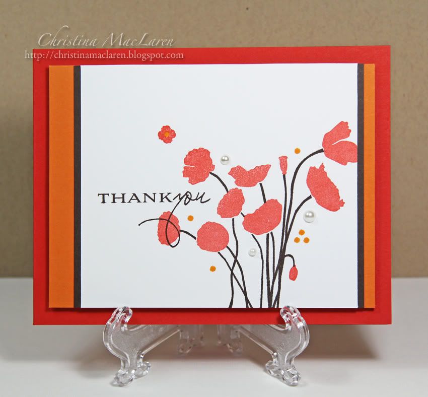
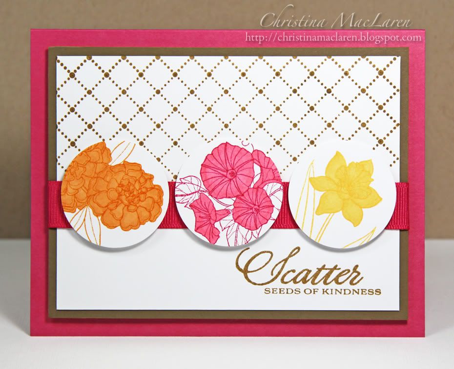
I don't have Crushed Curry, so I used the closest thing I had.  The inspiration for my card came from THIS gorgeous card that Andrea posted during the last PTI blog hop.  I can't get over her amazing coloring!  I love the way she stamped the flowers inside punched circles, so I borrowed that idea for my card.

The blooms are from PTI's Year of Flowers Collection, stamped in Pumpkin Pie, Melon Mambo, and  Martha Stewart's Curry ink.  I originally planned  to leave them uncolored, but there wasn't enough contrast with the white background so I simply filled them in with Copic markers.

The white cardstock is stamped with PTI's Background Basics:  Tin Types and wrapped with pink ribbon.  I matted the panel with Soft Suede cardstock and popped it up on foam adhesive onto a Melon Mambo card base.

Cardstock:  Stampin' Up! (Melon Mambo, Soft Suede), Papertrey Ink (white)
Stamps:  Papertrey Ink (Year of Flowers Collection, Background Basics:  Tin Types)
Ink:  Stampin' Up! (Pumpkin Pie, Melon Mambo), Fiskars (Brown), Martha Stewart (Curry)
Tools:  EK Success (circle punch)
Accessories:  Michaels (ribbon)

Be sure to hop over to the ColourQ blog today to check out the rest of the DT samples, then link up your creation!

Thanks for stopping by today!  I have a busy week ahead, but I hope to be back with another card soon.  Have a great day!

May 28, 2011

Tuesday Trigger: The Pyrex Effect

Spoiler Alert!   This post contains images from the Papertrey Ink Anniversary Set!  


Happy Memorial Day weekend to all my friends in the U.S.!  Do you have any plans for the long weekend?  We're working on adding lattice around the bottom of our deck, plus I have some sewing projects to finish and lots of cleaning to do before guests arrive next weekend.  The month of June is packed already, but I'm looking forward to summer month and all of the fun that comes with it!

I hope I've given you a chance to navigate away from this page if you haven't received your PTI Anniversary Set and still want to be surprised.  I wasn't positive that I would be receiving one, because I had to switch email accounts several months ago, plus it dawned on me that sometimes I was ordering with my married name and sometimes with my maiden name, depending on how I was paying.  But somehow PTI kept track of it all anyway, and I am very thankful to have received this beautiful stamp set.

My inspiration for this card comes from the Tuesday Trigger in the Moxie Fab World, which is this fun stack of colorful Pyrex bowls.  I'm pretty sure my mom had some just like these!  I pulled the red, orange, and chocolate brown from the photo, and I wanted to use strips of colored cardstock to emulate the stacked bowls.


A simple design, my favorite!  I stamped the stems from Botanical Silhouettes in Early Espresso, then the poppies in Scarlet.  I added some orange dots with one of the tiny circle stamps in the set and the sentiment in Espresso.

The main panel is matted on Early Espresso, then Pumpkin Pie cardstock and mounted on a Poppy Parade card base with foam adhesive to add a little bit of dimension to an otherwise flat design.

Cardstock:  Stampin' Up!  (Poppy Parade, Pumpkin Pie, Early Espresso), Papertrey Ink (white)
Stamps:  Papertrey Ink (Botanical Silhouettes)
Ink:  Stampin' Up! (Early Espresso), Clearsnap (Scarlet), Ranger (Spiced Marmalade)
Accessories:  Michaels (pearls)

I've been struggling to work with this stamp set for some reason, but Nichole's recent post featuring her creations with it really helped to inspire me.  

Have a great start to your weekend, and thanks for sticking with me through a long post!  

May 26, 2011

Year of Flowers Collection: Pansies


Well, I'm a little late to the party, but I thought I'd post my card for the Papertrey Ink Blog Hop anyway.  I had it all ready to post last night, but sometimes life gets in the way of the best of plans, doesn't it?

I was really excited to see the Year of Flowers Collection in the latest PTI release.  I only have the original YOF:  Mums, but the rest of the set is on my wish list.  The problem is that every time I go to order one of them, I can't decide which one!  So hopefully the mini versions in the new Collection will help me decide.

For this card, I chose the pansies.  First I masked the edges of my kraft card base using Post-it notes. I stamped the pansies several times in the center of the card in white ink, then colored them with Copic markers.  Once I removed the Post-its, I drew a frame with a white gel pen.

If I had the original YOF:  Pansies, I would have loved to color and cut out one of the larger flowers to layer over my sentiment banner.  Since that wasn't an option, I stamped the smaller blooms onto white cardstock, colored and cut them out, then popped them up on foam adhesive on a white doily.

All supplies from Papertrey Ink unless noted
Cardstock:  Kraft, Lavender Moon, white
Stamps:  Year of Flowers Collection, Ribbon Tails
Ink:  Frost White (Clearsnap), Copic markers, white pen (Inkssentials)
Tools:  Banner die
Accessories:  doily (Martha Stewart), embossing powder (Stampendous)

I'm thinking it would be fun to do a whole set of these with different flowers from the collection.

Thanks so much for stopping by!  Have a great night!

May 24, 2011

ColourQ #86


Well hello there, strangers!  Did you think I had abandoned you?  The last week has been busy, and I have had a serious lack of energy for crafting.  But today's ColourQ challenge got me back on track with a fun color combo and seriously cute inspiration photo!


I've been wanting to use these little teacups to make a CAS card, and this seemed like the perfect opportunity.  I die cut two white cups and stamped them with Early Espresso and red.  The third cup is cut from So Saffron cardstock and stamped with Saffron ink.  For the Daffodil, I added some baker's twine from The Twinery to the handle.

Cardstock:  Stampin' Up! (So Saffron), Papertrey Ink (white)
Stamps:  Papertrey Ink (Tea for Two Additions, Background Basics:  Retro, Ribbon Tails)
Ink:  Stampin' Up! (Early Espresso, So Saffron), Clearsnap (Cranberry)
Tools:  Papertrey ink (teacup die), We R Memory Keepers (Corner Chomper)
Accessories:  The Twinery (baker's twine), Papertrey ink (button), Michaels (pearls), DMC floss

My idea was to embellish each cup differently and then add a sentiment that emphasizes being unique.  I didn't have any pre-made sentiments that fit, so I combined parts of two sentiments from PTI's Ribbon Tails (the "be" from "best wishes" and the "you" from "thank you").  The lines are from Background Basics:  Retro, stamped in Early Espresso.

I'm kind of in love with this simple card.  What do you think of these colors?  I can't wait to see how you use them!

Thanks for your visit today, friends!  Have a good one!

May 18, 2011

CR84FN28 & Chevron Chic


I have had quilting on the brain lately, so this was bound to happen.  I recently mentioned that I am finally finishing a quilt that I started 4 or 5 years ago, and it has led to me spending way too much time on quilting and sewing blogs looking for inspiration.

Last night was one of those times, and I happened to notice a fabulous quilt on the blog banner of The Purl Bee that immediately made me think of two current challenges.  One is the color combo at CR84FN of red, yellow, and a neutral, and the other is the Chevron Chic challenge in the Moxie Fab World.  


Doesn't that colorful banner just make you giddy?  

To be completely honest, I'm not a big fan of chevron stripes and didn't think I would participate in this challenge, but I couldn't resist putting this idea on paper.  I pulled red and yellow patterned papers from Cosmo Cricket's Garden Variety mini deck, plus a yellow lattice paper from Making Memories that I found in my stash.  

I cut strips from each of the papers and lined them up in a chevron pattern, then stitched them onto Rustic White cardstock.  The Pure Poppy card base is a little bigger than an A2 to accommodate the stripes, about 4 1/2 X 6 1/2.

With such a busy background, I kept the sentiment panel simple with a sentiment from PTI's Quilter's Sampler, scored lines, and a red button tied with floss.

Cardstock:  Papertrey Ink (Pure Poppy, Vintage Cream)
Patterned paper:  Cosmo Cricket (Garden Variety), Making Memories (Spring)
Stamp:  Papertrey Ink (Quilter's Sampler)
Ink:  Papertrey Ink (Dark Chocolate)
Tools:  Martha Stewart (scoring board)
Accessories:  Papertrey Ink (button), DMC floss, thread

This was almost as fun as actual quilting.  *smile*

Okay, I'm off to spend some time with my little guy.  Thanks for stopping by today!

May 17, 2011

ColourQ #85


Happy ColourQ Tuesday, friends!  Are you ready for another challenge?  This combo had me scratching my head for a while, but I'm so happy with the results.  Let's dig right in, shall we?


Combining so many neutrals can be tricky, so I used small amounts of each and let the Peach Parfait be the star of the show.   Sorry, I couldn't help myself.

The starfish stamps are from WPlus9's Guiding Light, stamped in white all over the Peach cardstock.  The panel is matted with white cardstock, then Sahara Sand dsp, then mounted on a Basic Gray card base.  The stitching is actually brown, though it looks black in the photo.

I die cut the Basic Gray frame using PTI's Mat Stack 1 and Fillable Frames #11.  I cut two layers and stacked them to give it a little more weight.  I cut the white cardstock with Mat Stack 1, placed it behind the Basic Gray frame, and stamped through the window with Dark Chocolate ink.  The orange starfish was inked up with Tangerine Tango and stamped off once to better match the Peach cardstock.

To assemble, I popped the Gray frame up with foam adhesive and tied it with baker's twine.  Just a fun little detail that adds to the nautical flair.

Cardstock:  Stampin' Up! (Peach Parfait, Basic Gray), Papertrey Ink (white)
Patterned paper:  Stampin' Up! (Neutrals DSP)
Stamps:  WPlus 9 Design Studio (Guiding Light), Papertrey Ink (Fillable Frames #4 & #11)
Ink:  Papertrey Ink (Dark Chocolate), Clearsnap (Frost White), Stampin' Up! (Tangerine Tango)
Tools:  Papertrey Ink (Mat Stack 1 die, Fillable Frames #11 die)
Accessories:  The Twinery (Cappuccino baker's twine), thread

I know I say this every week, but the DT has some seriously amazing samples to share with you this week!  Such a diversity of styles and themes with these colors!

Thanks for dropping in today!  Have a great one!

May 15, 2011

PDCC #81 & CAS-ual Fridays #2


Do not adjust your screen, friends.  You are in the right place, and yes, I have done fun and cute.  Shocking, I know!  It's definitely not a style I turn to often, but I thought it would be perfect for a couple of challenges.  

First is the color combo at The Play Date Cafe, for which I chose to use PTI's Plum Pudding, Simply Chartreuse, and Soft Stone.  I combined it with the challenge at CAS-ual Fridays to use buttons and twine (two embellishments which pretty much epitomize fun and cute, wouldn't you say?).


I've wanted to try a twine frame for a while since seeing cards by Cristina HERE and Jenny HERE.  I also thought it would be the perfect time to break out this cute little turtle from DeNami, since they are sponsoring the challenge at CAS-ual Fridays this week.

I used my Stamp-a-ma-jig to line up the turtle and stamped it 3 times onto Soft Stone cardstock.  Drawing a grid lightly in pencil first helped me to space them evenly.  Then I added the sentiment "Smile", also from DeNami, to the bottom corner and highlighted it with a green gem.  The turtles were colored with Copics, and I added some "grass" to ground them.

To make the frame, I put a thin line of fabric glue around the edge of the Soft Stone panel and laid the twine down in it, wrapping it around the panel 3 times.  I added Plum Pudding buttons to the corners, with a fun little star button in the bottom corner to highlight the sentiment.

Cardstock:  Papertrey Ink (Plum Pudding, Soft Stone)
Stamps:  DeNami Design (Turtle, Heartfelt Greetings Petit Fours)
Ink:  Inkadinkadoo (Black), Copic markers
Tools:  Spellbinders (square die)
Accessories:  The Twinery (Lilac twine), Papertrey Ink (buttons), Queen & Co. (rhinestone)

Hope this one makes you smile!  I'm off to help hubby with the mountain of grading, ugh.  Thanks for stopping by today!  Have a great one!

May 13, 2011

Tuesday Trigger: Skirting the Issue


Well, I managed to survive the Blogger crash unscathed.  How about you?  Fortunately nothing I posted was affected, but I missed visiting all of my favorite blogs for 2 days!  

I finished this card a couple of days ago for this week's Tuesday Trigger: Skirting the Issue in the Moxie Fab World.  Here's the Trigger image:


You know how sometimes an idea for a card comes to you, and you have it all worked out in your head before you even sit down to work on it?  And then you make the card, and it's nothing like you had envisioned?  Yeah, that's kind of what happened here.  I'm not crazy about the results, but here it is all the same.  Please don't throw eggs at your screen.  *heehee* 


I was obviously inspired by the stripes and color scheme of the skirt in the photo, and I also wanted to incorporate pleats, which I did on the sentiment banner.  I also included stitching and a dress form.

Not sure what it is that the card seems to be missing, but if you think of something feel free to share, 'kay?

Cardstock:  Papertrey Ink (Fine Linen, Melon Berry, New Leaf, Lemon Tart, white)
Stamps:  Papertrey Ink (Signature Series:  Dress Form, Year of Flowers:  Mums)
Ink:  Stampin' Up! (Wild Wasabi), Clearsnap (Papaya Cream)
Tools:  Spellbinders (scallop circle die)
Accessories:  buttons, thread

Okay, hubby is waiting very patiently for me to finish up this post and spend some quality time with him in front of the DVR.  Hope you have a great start to your weekend, friends!  Thanks for stopping by!

May 11, 2011

CAS-ual Fridays #1 & CR84FN27


Hello, friends!  I had a few minutes to make a card this morning and thought I'd share it with you.  I'm exicted to play in a new challenge that should be lots of fun for those of us who love the CAS style, CAS-ual Fridays.  The first challenge is to use text as part of the design.  I also used the current colors at CR84FN


I started with a Vintage Cream card base and used a PTI flower die to cut two flower "windows" in the card front.  Next I stamped text from Background Basics:  Text Style onto a Vintage Cream cardstock panel.  I adhered the text-stamped panel behind the card front to fill the flowers with the text.

I stamped the flower from PTI's Signature Series:  Flower in bright pink onto the card front, then added one of the sentiments from the set in gray.

To finish the card, I simply scored a line 1/8 inch inside the entire card front to frame it, then added three gray rhinestones around the sentiment.  A CAS design with several little details that keep it interesting.  My favorite kind of card!


Cardstock:  Papertrey Ink (Vintage Cream)
Stamps:  Papertrey Ink (Signature Series:  Flower, Background Basics:  Text Style)
Ink:  Stampin' Up! (Melon Mambo), Clearsnap (Antique Pewter)
Tools:  Papertrey Ink (flower die), Martha Stewart (Scoring Board)
Accessories:  Michaels (rhinestones)

Thanks so much for stopping by today!  Hope you're having a good one!

May 10, 2011

ColourQ #84 & Card Patterns #114


Good morning!  I hope your day is off to a great start.  Today is Tuesday, which means a new ColourQ challenge!  It's never too early to start working on those Father's Day cards, and this week's color combo is perfect for a masculine card.  But as always, the DT has showcased a variety of card and layout styles to inspire you, so be sure to stop by and see their fabulous creations!

I haven't played in the Card Patterns sketch challenge for a while (sketches are definitely the most challenging for me!),  but I love the sketch this week and decided to give it a try.


 I started with a kraft card base, then added a NQN panel that I ran through my Big Shot with the Linen & Canvas impression plate.  The Old Olive strip is heat embossed in white with a sentiment from PTI's Masculine Motifs, with some scored lines for interest.  Layered beneath it is a strip of kraft cardstock punched with a notebook border.

For the focal panel, I stamped scallops from PTI's Background Basics: Retro onto a white cardstock strip and rounded the bottom corners.  The boat image is from Masculine Motifs, stamped in NQN onto kraft and cut out with a circle Nestie.

For a pop of yellow, I die cut buttons from Daffodil cardstock (each button has two layers for added weight).  Every time I order from PTI I forget to order the coasters for cutting these buttons!  But I love that they add interest without adding bulk, so this card is fairly flat for mailing.

Cardstock:  Stampin' Up! (Not Quite Navy, Old Olive, Daffodil Delight), Papertrey Ink (Kraft, white)
Stamps:  Papertrey Ink (Masculine Motifs, Background Basics:  Retro)
Ink:  Stampin' Up! (Not Quite Navy), Clearsnap (Frost White)
Tools:  Papertrey Ink (Linen & Canvas impression plate, button die), Spellbinders (circle die), EK Success (border punch), Martha Stewart (Scoring board), We R Memory Keepers (Corner Chomper)
Other:  Stampendous (embossing powder)

I hope you'll play along with the colors this week!  I hope to do a much better job of getting around to make comments on all of your entries this week, as well.  The last few weeks have been especially swamped with end of semester grading (which I do for one of my husband's night classes) and other end of the school year activities.  I'm sure you all know how it gets sometimes!

I appreciate your visits here so much, friends!  Thank you for your sweet comments and support!

Have a great one!

May 7, 2011

Make it Monday #13 meets Tuesday Trigger: A Polka Dotted Hullabaloo


Good morning!  I hope you all have a wonderful weekend planned.  We have several fun things on the agenda for today, so I'll get right to today's card.

I've been mulling over this week's Tuesday Trigger:  A Polka Dotted Hullabaloo for quite a while, and when PTI released the latest Make it Monday challenge, it was just the inspiration I needed.  The Trigger photo this week is some fun fabric from Moda.  The Make it Monday challenge is to use an impression plate and die simultaneously.  Hop on over and see the video tutorial if you haven't already--this is one cool technique!


I started by lining up the eyelet border die toward the bottom of the polka dot impression plate, then ran it through my Big Shot with some Ocean Tides cardstock.  The impression of the eyelet border looked great, but the center holes were partially cut out.  That gave me the idea to punch them out completely and place strips of colored cardstock behind the holes to replicate the polka dots in the trigger photo.

For the focal point, I die cut Mat Stack 3 from white cardstock and stamped it with the coordinating polka-dotted label and a sentiment from Boy Basics:  Truckin' It.  I die cut, stamped, and colored the fire truck from the same set and popped it up on foam dots.  A few threaded buttons mimic the colored dots and add the finishing touch.


All supplies from Papertrey Ink unless noted
Cardstock:  Ocean Tides, Pure Poppy, Bashful Blue, Harvest Gold, white
Stamps:  Boy Basics:  Truckin' It, Mat Stack 3 Collection
Ink:  Ocean Tides, Cranberry (Clearsnap), Black (Inkadinkadoo), Copic markers
Tools:  Polka Dot impression plate, Eyelet Border die, Mat Stack 3 die, Truckin' It die
Accessories:  buttons, DMC floss

For all of the moms out there, I hope you have a fantastic Mother's Day!  We all deserve to be spoiled for at least one day each year, don't you think?

Thanks for stopping by, friends!

May 6, 2011

Color Cue 14


Hey there, friends!  Just popping in to share a card for the current Color Cue challenge that is ending tomorrow.  I finished this one a couple of days ago but haven't had time to post it.  Posting and commenting on blogs have taken a back seat lately to basketball and hockey playoffs at night and quilting by day.  For some reason I was motivated to pull out an unfinished quilt top that I started over 4 years ago!  I am the queen of  half-finished projects, so I am thrilled to be able to say that I completed the quilt top yesterday and I'm ready to assemble the back and baste it all together this weekend.

Okay, you probably came here for a card, so I'll get to it!  Here are the lovely colors of the Color Cue:

 I decided to get a start on Father's Day cards, using WPlus9's Woodgrain Silhouettes and Additions to stamp a pretty leaf image.  This card was totally inspired by THIS beauty by Kasia.  Love the way her leaves look like they are gently falling across the card.

The kraft panel is debossed with PTI's Woodgrain impression on either side of the leaves, and I added some tea dye to highlight the grain.

I die cut a double-ended banner from red cardstock and stamped it with a sentiment from Woodgrain Silhouettes.

Cardstock:  Papertrey Ink (Kraft, Pure Poppy, Dark Chocolate, Rustic Cream)
Stamps:  WPlus9 Design Studio (Woodgrain Silhouettes, Woodgrain Silhouettes Additions)
Ink:  Papertrey Ink (Dark Chocolate, Hawaiian Shores, Chai tea dye)
Tools:  Papertrey Ink (Woodgrain impression plate, banner die), Martha Stewart (Scoring Board)

I'll be back tomorrow with a card for PTI's Make it Monday.  I hope you'll come back to check it out!  Thanks for stopping by tonight!

May 3, 2011

Verve April Diva Dare


Hello again!  As promised, I'm back with a second card for today.  I've been wanting to play along with this month's Verve Diva Dare with the theme "April Showers Bring May Flowers".  When I think of May flowers, I definitely think of Mother's Day and the gorgeous blooms that are starting to pop up everywhere.


I used Verve's Dream Big flower and leaf stamps, which I absolutely love and need to pull out more often.  I used Stampin' Up!'s En Francais background on Vintage Cream cardstock, then inked the edges with Perfect Plum ink.  I adhered it to a purple card base, then positioned a circle Nestie over the front to cut out a window.

I stamped the leaves over the French script background, then layered a hand cut flower from Dream Big and two smaller, die-cut flowers topped with buttons.

Cardstock:  Papertrey Ink (Plum Pudding, Vintage Cream)
Stamps:  Verve (Dream Big), Stampin' Up! (En Francais), Papertrey Ink (Mega Mixed Messages)
Ink:  Stampin' Up! (Perfect Plum), Clearsnap (Moss Green), Copic marker
Tools:  Spellbinders (circle die), Papertrey Ink (Beautiful Blooms die)
Accessories:  Papertrey Ink (buttons), Michaels (pearls), DMC floss

On the inside of the card, I stitched a circle with purple floss on a Vintage Cream panel and stamped the word "Mother" from PTI's Mega Mixed Messages.  I added another flower and leaves and a few Copic-colored pearls. 


I really love making window cards, but I don't think to do it very often, so I had a lot of fun with this one.

Thanks for your visit tonight!  I hope your week is off to a great start!

ColourQ #83


Hello friends!  I know it has been quiet around here lately, but I'm back today with the latest ColourQ color challenge!  It's a bright and summery combo that has me daydreaming of warmer weather and lazy days on the beach.


As you can see, I went bold and bright for my card, as well.  I was additionally challenged by the fact that I only have Tangerine Tango ink, so I knew my stamping would be limited to that color.  I chose the beautiful leafy frond from WPlus9's Woodgrain Silhouettes Additions and a sentiment from PTI's Signature Series:  Butterfly.

I had the card finished, then thought it needed a little something else, so I rounded one corner.

Cardstock:  Stampin' Up! (Tempting Turquoise, Daffodil Delight, Peach Parfait, Tangerine Tango), Papertrey Ink (Vintage Cream)
Stamps:  WPlus9 (Woodgrain Silhouettes Additions), Papertrey Ink (Signature Series:  Butterfly)
Ink:  Stampin' Up! (Tangerine Tango)
Tools:  We R Memory Keepers (Corner Chomper)
Accessories:  Michaels (rhinestones)

The rest of the Royal Court DT has wonderful samples to share with you today, so stop by the ColourQ blog for a peek!  I hope you'll play along with us this week!

Thanks for dropping in today!  I'll be back with another card tonight, so I hope you'll come back to check it out.  Have a good one!
Related Posts Plugin for WordPress, Blogger...