
Hello! I'm thrilled to say that I received a happy email from Paper Crafts magazine yesterday, as one of my cards was accepted for publication in Card Creations. Thank you, PC!
I thought I'd share one of the cards that wasn't picked up, which I happen to love nonetheless. *smile*
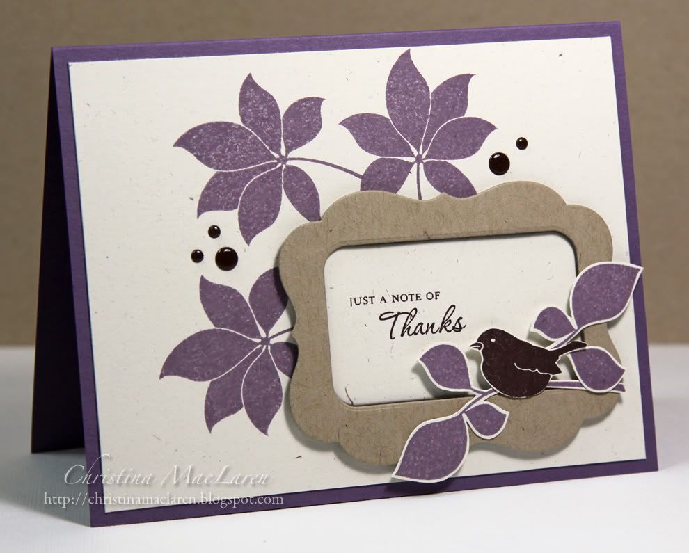
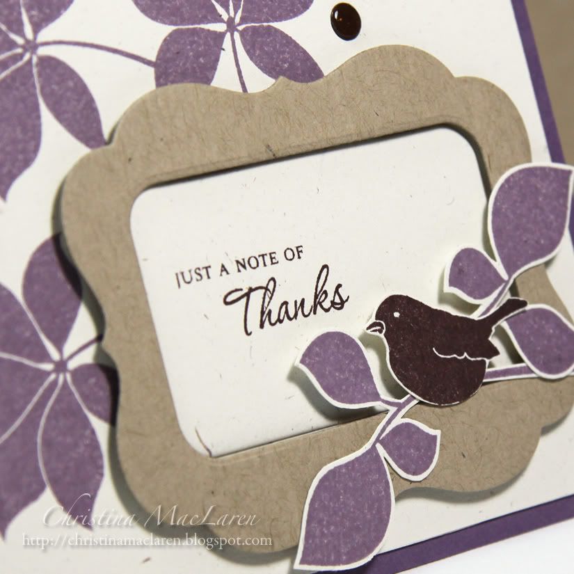
This purple number features stamps from WPlus9's Woodgrain Silhouettes Additions. After stamping the leaves on a Rustic Cream panel, I added a Kraft die cut frame that is debossed with woodgrain. I die cut a piece of Rustic Cream cardstock to go in the "window" and stamped it with a sentiment from PTI's Gracious Vases.
The little birdie and leaves were stamped and cut out by hand, then perched on the corner of the frame.
The design seemed a little unbalanced, so I added some brown "pearls" to create a visual triangle with the bird. I just used some die cut circles and gave them a coat of Glossy Accents for shine.
Cardstock: Papertrey Ink (Plum Pudding, Rustic Cream, Kraft, Dark Chocolate)
Stamps: WPlus9 Design Studio (Woodgrain Silhouettes Additions), Papertrey Ink (Gracious Vases)
Ink: Stampin' Up! (Perfect Plum, Chocolate Chip)
Tools: Papertrey Ink (Mat Stack 4, Fillable Frames #7 dies, Woodgrain impression plate)
Accessories: Ranger (Glossy Accents)
I've been working feverishly on my Christmas cards today, so I'll have some of those to share with you in the coming days.
Thanks for your visit! Enjoy the rest of your weekend!


15 comments:
Congrats on the publication! Too bad this one wasn't picked up....I love it! (sadly, I wasn't a recipient of any happy mail this time around- maybe I'll share one of mine that didn't make the cut on my blog!)
Congrats on the publication Christina! :) I love this beauty! They were crazy not to pick it up!
Love the coloru combo and the brown "pearls" are a perfect addition. Congrats on the publication :)
Congrats on the publication note from PC! Have to love happy email! This is a beauty! Love that you use non-traditional colors for the leaves. Gorgeous!
WOO HOO!!! Doing a happy dance for you!!! Congrats Christina!
This card is STUNNING! I love purple (you make me love purple even more than I already do!) - amazing layout!
You go girl!!!
A big congratulations to your Christina I think all of your cards are worthy of publication, can't believe they didn't pick this one too, I love it. Hoping to see the others soon, again kudos to you! I'd be doing a "happy dance".
Congratulations to you! Are you hoping like I am that Dawn is going to make dies for this set next? What a beautiful card, love the color combination and the design.
I can't believe that this lovely card wasn't picked up. It's going into my files to CASE!
Beautiful card, love the frame and I hardly use purple, really must try more often.
Beautiful! Seriously stunning use of color, and the composition is spot on! Just perfect. And yes Karen...this is the next older set for a die realease. But not next release...possibly a mid release though.
So, so pretty! I LOVE it, too, especially that little, framed sentiment on top of those leafy branches! And a HUGE congrats on your publication! It's so deserving!
Yeah for you my friend! I can't wait to see it in the mag!
This card is gorgeous, loooove the purple!
Such pretty colors! I love those flowers and the frame you created too! I really like the 'pearls' you made as well! This card is definitely a winner in my eyes! :)
Super PRETTY!!!
Congrats on the pub and I'm excited to say I'll be joining you in the issue! Whoop whoop!
Love your Glossy Accented dots!
Post a Comment