
Good morning! It's ColourQ day! I'm still finishing up my Christmas cards, and you'll be seeing more of them this week, but thank goodness this fresh color combo came along to inspire another design. Isn't it a fun twist on the traditional holiday colors?

I had to substitute Garden Green and Lucky Limeade for the greens, but they worked just fine!
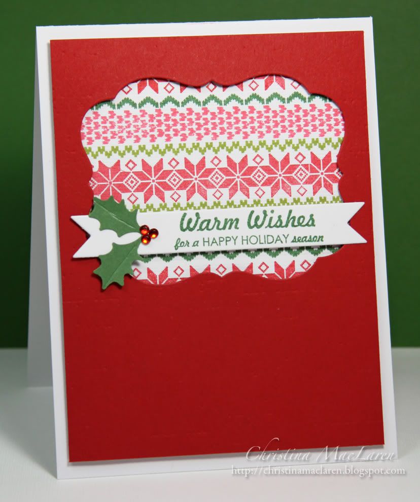
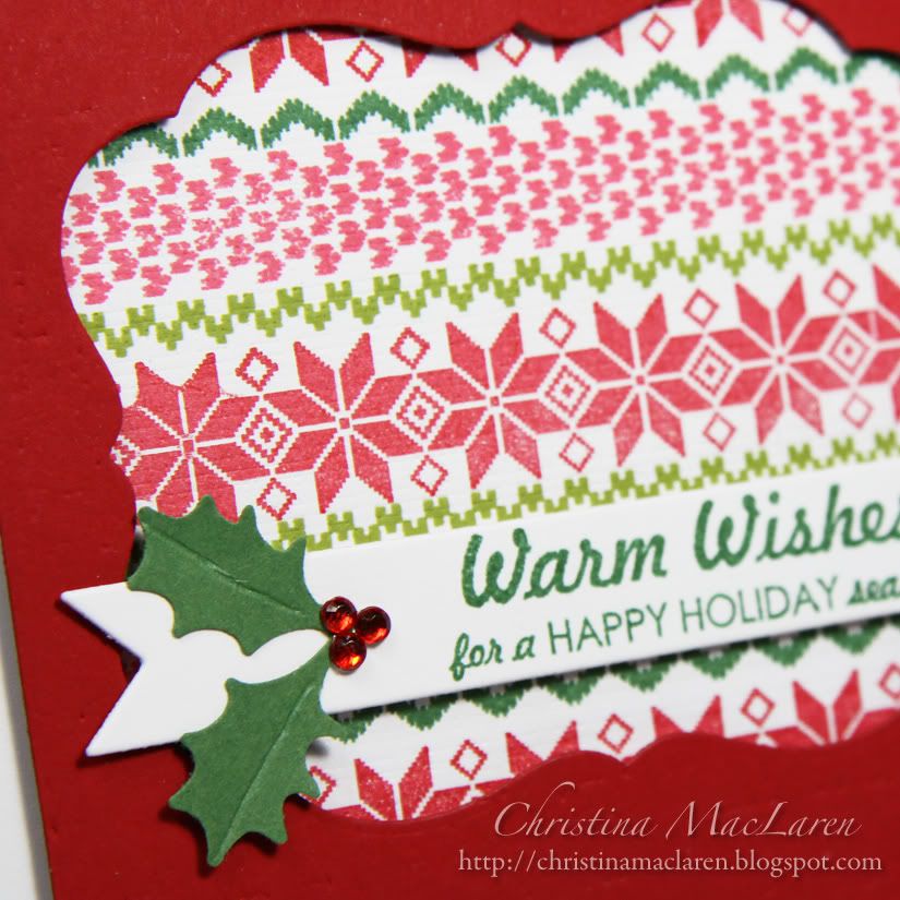
I had this design buzzing around in my head since I started working with WPlus9's Fair Isle Backgrounds. I stamped the pattern on a square of white cardstock, then placed it behind a die cut window. I used PTI's Linen & Canvas impression plate to add canvas texture to the stamped piece and linen texture to the red panel.
My red ink is looking a little washed out in these photos, but I really did use both red and Regal Rose to stamp the pattern!
The sentiment, from WPlus9's Winter Wishes, is stamped onto a double-ended banner and embellished with punched holly leaves and rhinestone berries.
Cardstock: Papertrey Ink (Pure Poppy, white)
Stamps: WPlus9 Design Studio (Fair Isle Backgrounds, Winter Wishes)
Ink: Stampin' Up! (Regal Rose, Garden Green, Lucky Limeade), Clearsnap (Cranberry)
Tools: Papertrey Ink (Mat Stack 4, Double Ended Banner dies, Linen & Canvas impression plate), Martha Stewart (holly punch)
Accessories: Michaels (rhinestones)
Be sure to stop by the ColourQ blog today to check out the rest of the DT samples and get the details on how to play along. I hope you'll join us this week!
Thanks for visiting today!


12 comments:
Christina, this is so beautiful - I love all the colors! Of course it will look great with green instead of red - because you made it!
It's beautiful! and, yes, green will be equally fabulous!
Perfection! I love this design! And I am just loving those Fair Isle Background stamps! So pretty!
This is just totally gorgeous Christina! LOVE the die cut window and those gorgeous strips of gabulous color!
sooooo pretty!! How do you keep coming up with these beautiful cards? You are such an inspiration.
This is wonderful!!! I have got to try the "window"!!!
Oh, this is gorgeous (again!). Love the idea of the pattern filling up so much of the window. I think when I do negative die cuts, I think in smaller terms, so this is a good reminder and inspiration to go bigger.
This is a beautiful card! I will definitely use this technique and source it back to you! Very inspiring, TFS!
wow, you are rockin that set. love the cutout.
Beautiful take on the challenge Christina. I am still loving the Fair Isle Background stamp.
Oh I love this! Just fantastic Christina!
Oooh yes! I think it would look good framed in green too!
Post a Comment