September 27, 2011

Happy Birthday ColourQ!

Hello, friends!  I'm so glad you stopped by today, because it's a very special week at the ColourQ.  The challenge is celebrating its second birthday with color combo #104, and there's a fun twist this week.  In addition to a fabulous color palette (as always!), we are choosing a past Colour Queen to CASE!  Arielle has worked hard to create a photo album of all of the past winners, which you can find linked on the ColourQ blog.  I hope you'll take some time to browse through all of the amazing creations and choose a favorite to CASE!
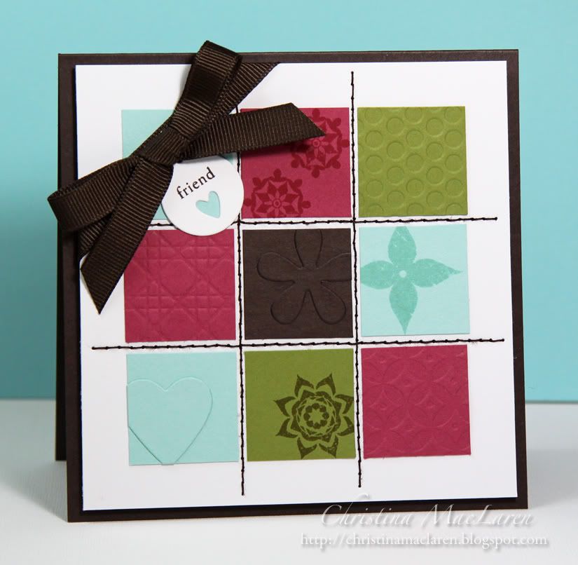
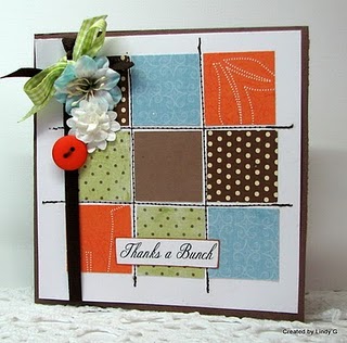
For my card, I chose an awesome grid design by Colour Queen #74, Lindy G.  You can check out her winning card along with all of the fabulous Courtiers HERE.


I love the versatility of Lindy's design!  She used some wonderful patterned papers on her card, but since I didn't have patterned papers in the challenge colors, I used a few different techniques on the blocks to give them some interest.

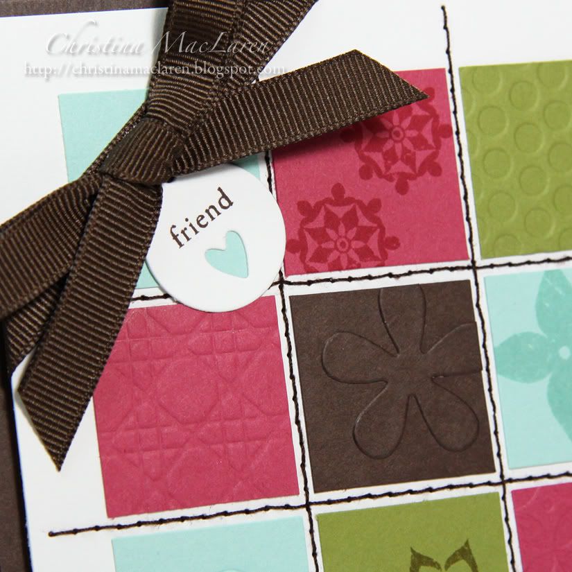
Lots of Papertrey goodies on this one!  Three of the colored squares are stamped with medallions from Iconic Images.  Three more squares are debossed with impression plates (Polka Dot Basics, Cane Print, and Diamonds).  Two squares use the faux embossing technique, where I die cut a shape from the same color cardstock and adhered it to the square, trimming the edges to fit.

The squares were adhered to a white panel, then I stitched a grid with brown thread just like in Lindy's original.  For the ribbon, I decided to wrap it around the top corner and add a simple die-cut tag, from PTI's Tiny Tags.

Cardstock:  Stampin' Up! (Early Espresso, Rose Red, Pool Party, Old Olive), Papertrey Ink (white)
Stamps:  Papertrey Ink (Iconic Images, Tiny Tags)
Ink:  Stampin' Up! (Rose Red, Pool Party, Old Olive, Early Espresso)
Tools:  Papertrey Ink (Polka Dot Basics, Cane Print, Diamonds impression plates, flower, heart, tag dies)
Accessories:  Michaels (ribbon), thread

It was so much fun revisiting the past Colour Queens for this challenge, and I hope you'll take a peek at the gallery, too!  Happy birthday to the ColourQ, and many thanks to Arielle for inspiring us every week with amazing color palettes and for all of the hard work she puts into the challenge!  Be sure to stop by the ColourQ blog to congratulate her!

Thanks for visiting!

September 25, 2011

Papertrey Ink September Blog Hop


Hello friends!  It's time for another Papertrey Ink Blog Hop, and I'm happy to have found time to play.  The challenge this month is to be inspired by a photo of this fun and colorful striped floor:


I pulled out the colors Pure Poppy, Summer Sunrise, Smokey Shadow, and Hawaiian Shores from the stripes in the photo.  I cut strips of cardstock and debossed them with the Cane Print impression plate, then adhered them to a white panel.

I attached a strip of white twill across the bottom and stamped a sentiment above it, from Faux Ribbon.  Finally, I added a trio of Hibiscus Burst buttons threaded with black floss.

All supplies from Papertrey Ink unless noted
Cardstock:  White, Pure Poppy, Summer Sunrise, Smokey Shadow, Hawaiian Shores
Stamps:  Faux Ribbon
Ink:  Black (Inkadinkadoo)
Tools:  Cane Print impression plate
Accessories:  Hibiscus Burst buttons, twill ribbon (A.C. Moore), DMC floss

Thanks for stopping by today, and happy hopping!

September 22, 2011

Card Patterns #133


Hi there!  I've been working on this card a little at a time for the last few days.  So glad to see I'm not too late to enter it for the sketch challenge at Card Patterns!


When I saw the three background panels, I decided I wanted to try something I saw Jennifer McGuire do for Inspiration Showcase, using an embossing folder for a faux letterpress technique.  I inked up both sides to create positive and negative versions of the pattern, then stitched the panels to a piece of Wisteria Wonder cardstock.

The die cut panel is stamped with a label from Waltzingmouse's Vintage Labels 18 and a sentiment from WPlus9's Very Vintage Greetings and heat embossed.

I rolled a few cardstock flowers and adhered them to the label with some die cut kraft leaves.

Cardstock:  Papertrey Ink (Lemon Tart, Kraft, white), Stampin' Up! (Wisteria Wonder)
Stamps:  Waltzingmouse (Vintage Labels 18), WPlus9 Design Studio (Very Vintage Greetings)
Ink:  Stampin' Up! (Wisteria Wonder), Versamark
Tools:  Sizzix (embossing folder, leaf die), Spellbinders (Labels 18)
Accessories:  Michaels (pearls), Stampendous (embossing powder), thread

This card will go out to my parents for their anniversary next week!

Thanks for your visit, friends!  I hope you're having a great week.

September 20, 2011

ColourQ #103


Welcome back, friends!  It's a dreary day here, so I'm more than happy to be sharing some cheerful hues for this week's ColourQ challenge.  Wouldn't these dishes brighten up anyone's day?


The florals had me thinking immediately of Stampin' Up!'s Fabulous Florets.  After a few trials on scrap paper to get the right placement, I stamped the leaves with Pear Pizzazz in the bottom left corner of a white cardstock panel.  I added the large solid blossom in Wisteria Wonder.

It's hard to tell in the photo, but the large open flower is stamped in red and the smaller flowers are stamped in Calypso Coral.  I cut these out and popped them up on foam dots.

The sentiment is from PTI's Signature Greetings, and the whole panel has a pretty texture from the Linen & Canvas impression plate.  I adhered it to a Wisteria Wonder card base and wrapped some gorgeous Coral ruffled ribbon around the top.

Cardstock:  Stampin' Up! (Wisteria Wonder), Papertrey Ink (white)
Stamps:  Stampin' Up! (Fabulous Florets), Papertrey Ink (Signature Greetings)
Ink:  Stampin' Up! (Wisteria Wonder, Pear Pizzazz, Calypso Coral), Clearsnap (Scarlet)
Tools:  Papertrey Ink (Linen & Canvas impression plate)
Accessories:  Stampin' Up! (ribbon)

This card is on its way to an amazing friend of mine.  I think she'll like it!

I hope you'll play along with us at the ColourQ this week!  Be sure to check out the samples from the rest of the Royal Court DT and link up your creation to be in the running for Colour Queen.

Thanks for visiting today!  Have a good one!

September 19, 2011

Card Ideas for Paper Crafters Vertical Sketch Challenge & CTD #159


Hello there!  I'm happy to say that the worst of my cold is behind me, and hopefully this will be a productive week.  I'm just sneaking in a card for the Vertical Sketch Challenge over in the Moxie Fab World.  I paired it up with the current colors from The Color Throwdown.


I started by cutting a heart from a scrap of paper, then traced it onto Cherry Cobbler cardstock three times and cut out the hearts.  Two are debossed with a music score and the third is stamped with PTI's Background Basics:  Sheet Music.  I sponged the edges of all three hearts with black ink for definition.

The black cardstock panel is also debossed with the Music Score impression plate, with a sentiment from WPlus9's Spring Post heat embossed in white in the bottom corner.

The top panel is white cardstock stamped with Background Basics:  Houndstooth using Pacific Point ink.

Cardstock:  Stampin' Up! (Cherry Cobbler, Pacific Point), Papertrey Ink (True Black, white)
Stamps:  Papertrey Ink (Background Basics:  Sheet Music, Background Basics:  Houndstooth), WPlus9 Design Studio (Spring Post)
Ink:  Stampin' Up! (Pacific Point), Clearsnap (Frost White), Inkadinkadoo (Black)
Tools:  Papertrey Ink (Music Score impression plate)
Accessories:  Michaels (ribbon), Stampendous (embossing powder)

There you have it:  a not-too-girly love note well ahead of Valentine's Day.  I think the houndstooth helps to tone down the mushiness.

I hope you have a great week ahead of you!  Thanks for spending a little bit of it here with me!

September 16, 2011

Horizontal Sketch Challenge in the Moxie Fab World


Well, hello again!  Thanks for stopping by tonight!

I just couldn't resist playing along with the Horizontal Sketch Challenge for Card Ideas Week in the Moxie Fab World.  After all, Cath was so sweet to share my first published card on her blog as an example of this sketch!


This time I flipped the sketch horizontally because it seemed to work better with the teacups from PTI's Tea for Two Additions.  I used papers from DCWV's Amber Autumn Stack to die cut and stamp the cups, then added some basic shading with Copics.

I stamped the tea bag and a sentiment from Tea for Two Additions, then the phrase "warm wishes" from Tiny Tags onto a Lemon Tart cardstock panel.  I debossed the edges of the panel with the Diamonds impression plate to frame the cups, which are adhered with foam dots.

The yellow panel is mounted on a kraft card base with a strip of patterned paper along one end.

Cardstock:  Papertrey Ink (Lemon Tart, Kraft)
Patterned paper:  DCWV (Amber Autumn Stack)
Stamps:  Papertrey Ink (Tea for Two Additions, Tiny Tags)
Ink:  Stampin' Up! (Chocolate Chip)
Tools:  Papertrey Ink (Diamonds impression plate, teacup die), Martha Stewart Crafts (Scoring board)

I'm off to rest, as I have been battling my first head cold of the season.  Yuck.

Have a wonderful weekend!

September 15, 2011

CardPatterns #132 & CAS-ual Fridays #19


Hello, friends!  I want to say a huge thank you to everyone who has commented or emailed to congratulate me on my big win during PTI's release festivities.  I am still somewhat in shock and utterly thrilled to have so many fabulous new stamp sets coming my way.  Thanks for sharing in my excitement!

I've managed to be a little more productive in my craft room this week, so I have a card to share that was inspired by two challenges.  First is a square sketch at Card Patterns, and second is the CAS-ual Fridays challenge to use paper piecing on a fall-themed project.

I picked up several adorable Halloween stamps in the dollar bin at Michaels a couple of weeks ago, including this cute smiling ghost.  I knew he would look great dressed up in different patterns!

I chose three dotted papers from DCWV's Amber Autumn Stack to piece the ghosts.  I stamped them again onto white cardstock and added some shading with Copic markers.  The panel is adhered with foam dots, with a pinked rose border along the bottom.

I added a simple "boo!" sentiment with stickers and tucked a scrap of black ribbon in the top corner.

Cardstock:  Papertrey Ink (True Black, white), Stampin' Up! (Regal Rose)
Patterned paper:  DCWV (Amber Autumn Stack)
Stamps:  Michaels (ghost)
Ink:  Inkadinkadoo (Black), Copic markers
Tools:  pinking shears
Accessories:  Michaels (letter stickers, ribbon)

This card just makes me smile!  How about you?

Thanks for stopping by tonight!  Have a great one!

September 13, 2011

ColourQ #102


Good morning, ColourQ fans!  Are you ready for a new challenge?  Today's inspiration comes from a colorful stack of mixing bowls that are welcome to come and live in my kitchen.  Aren't they fun?


These colors are perfect for a guy card, so I conjured up something preppy and masculine for a male friend's upcoming birthday.  It's low on the frills but still packs a colorful punch, don't you think?

I started with a Basic Gray card base, then added a panel debossed with PTI's Argyle impression plate.  A strip of white cardstock is stamped with a sentiment from Birthday Basics in gray (though every time I use this ink I realize I need to get one in a darker shade).

The white strip was given some texture with the Linen & Canvas impression plate.  I added two gray rhinestones next to the sentiment--hopefully my guy friend appreciates a little bling!

The colored strips were simply trimmed at different lengths and adhered with foam dots to give the card some dimension, while still keeping it relatively flat for mailing.

Cardstock:  Stampin' Up! (Basic Gray, Poppy Parade, Tempting Turquoise, Certainly Celery), Papertrey Ink (white)
Stamps:  Papertrey Ink (Birthday Basics)
Ink:  Clearsnap (Antique Pewter)
Tools:  Papertrey Ink (Argyle, Linen & Canvas impression plates)
Accessories:  Michaels (rhinestones)

I hope you'll take some time this week to play along with us at the ColourQ!  Thanks for stopping by today!

September 12, 2011

Tuesday Trigger: Garden Glory


Hey, look at me!  I made a card!  *smile*

I was looking forward to the weekend so much, thinking I would get lots of crafting done.  Too bad my mojo booked a vacation.  I had the hardest time getting anything to work on paper, but I finally finished a card for the current Tuesday Trigger in the Moxie Fab World:


This shouldn't have been so difficult for me.  After all, these colors were practically screaming my name!

Enough complaining.  How about some details?  I started with an Aqua Mist card base, which I stamped and heat embossed with a frame from the Mat Stack 1 collection and a sentiment from WPlus9's Very Vintage Greetings.  The fonts in this set are divine!  The frame is meant to reflect the color and shape of the chair back in the photo.  The whole panel was then debossed using PTI's Linen & Canvas impression plate.

As an ode to the green and white pattern on the chair, I die cut two strips of Victorian Lace border from New Leaf cardstock and adhered them to a strip of white.  I love the graphic pattern that results.  The strip is layered over Dark Chocolate cardstock embossed with woodgrain, like the dark brown table in the photo.

To pull in the botanical print on the pillow, I stamped a morning glory from Very Vintage Greetings and colored it with Copics, then cut it out and popped it up on foam dots.

Cardstock:  Papertrey Ink (Aqua Mist, New Leaf, Dark Chocolate, white)
Stamps:  WPlus9 Design Studio (Very Vintage Greetings), Papertrey Ink (Mat Stack 1 Collection)
Ink:  Clearsnap (Frost White), Stampin' Up! (Chocolate Chip), Copics
Tools:  Papertrey Ink (Woodgrain, Linen & Canvas impression plates, Victorian Lace border die)
Accessories:  Stampendous (embossing powder), buttons, DMC floss

I hope to settle into more of a routine this week that involves some stamping time!  It's so hard to get in the groove after not doing it for several days.  Does that happen to you?

Thanks for stopping by, my friends!  Have a great start to your week!

September 7, 2011

Make it Monday #31


Hello friends!  It's been a while since I played along with PTI's Make it Monday challenge, so I made a little time for it after work yesterday.

This week's challenge is to make a background using a non-background stamp.  I chose a branch image from Turning a New Leaf.

The branch was stamped repeatedly onto Rustic White cardstock using ink that is a close match to Melon Berry.  I added some scattered berries (from Harvest Berries) in burgundy.

The panel was adhered to a Scarlet Jewel base, and a punched Ripe Avocado border was added along the right edge.

I chose a sentiment from Healing Touch Sentiments and a frame from Mat Stack 1 Collection and stamped them onto the coordinating mat stack.  A die cut branch frames the sentiment, and a strip of scored Scarlet Jewel cardstock helps to ground the sentiment panel.

The design seemed a little heavy on the left side, so the Ripe Avocado button was added for balance.

All supplies from Papertrey Ink unless noted
Cardstock:  Scarlet Jewel, Ripe Avocado, Rustic White
Stamps:  Turning a New Leaf, Healing Touch Sentiments, Mat Stack 1 Collection, Harvest Berries
Ink:  Papaya Cream, Chianti (Clearsnap)
Tools:  Mat Stack 1 die, branch die (Sizzix), border punch (EK Success), Scoring board (Martha Stewart), corner rounder (We R Memory Keepers)
Accessories:  Ripe Avocado button, DMC floss

I hope you're having a great week so far!  Thanks for stopping by today!

September 6, 2011

ColourQ #101


Good morning!  After the long weekend here in the U.S., I nearly forgot that today is Tuesday and time for another fabulous ColourQ challenge!

Are you loving the new SU In Colors as much as I am?  Luckily for us, Arielle has included two of them in this week's color combo, which is inspired by a delicious fabric tote.


I haven't had much time to play with my newest stamps from Papertrey Ink, so I couldn't wait to ink up the gingko leaves from Harvest Berries.  *swoon*  I thought they would be perfect for a get well card for a co-worker who is having surgery this week.  

Usually when making a card, the sentiment is one of the last things I add, and often I don't even know what type of sentiment I'll use until the card is nearly finished.  For this card, I stamped the sentiment first for two reasons.  

First, I knew it would be a get well card, so I chose a phrase from PTI's Healing Touch Sentiments that I thought was most appropriate.  

Second, I wanted the sentiment in the "sweet spot", that intersection of imaginary lines that divides a card into thirds.  This is most appealing to the eye and draws your attention to the message immediately.

Once the sentiment was stamped in Rich Razzleberry, it was fairly quick and easy to frame it with gingko leaves stamped in Pool Party.  Next I added some texture with PTI's Linen & Canvas impression plate.

For a bit of dimension and contrast, I die cut two gingko branches, stamped them in Lucky Limeade, and popped them up with foam adhesive.

To balance out the Razzleberry sentiment, I added a scattering of stamped purple berries, then adhered the panel to a lavender card base.

Cardstock:  Papertrey Ink (Lavender Moon, white)
Stamps:  Papertrey Ink (Harvest Berries, Healing Touch Sentiments)
Ink:  Stampin' Up! (Lucky Limeade, Pool Party, Rich Razzleberry)
Tools:  Papertrey Ink (branch dies, Linen & Canvas impression plate)

I love the composition of this card, but if I made it again I think I would stamp off once before stamping the aqua leaves so they would be a little softer and fade more into the background, because as-is it seems a little busy.  But I adore these colors together and hope you'll find some time to take up the challenge using them this week!

Thanks for paying me a visit today!  I hope to catch up on comments and visits to your blogs very soon!

September 4, 2011

CR84FN37 & JUGS #100


Hello there, friends!  Sorry it's been quiet around here this week, but I'm finally back with a card for a couple of challenges.  The first is the color challenge at CR84FN which includes some lovely shades of blue plus a neutral.  The second started out with the 100th sketch at Just Us Girls, but after I'd finished it I realized I left out the horizontal strips behind the oval.  Oops!  Still, I thought I'd link it up to help them celebrate their milestone!


The idea for this card came because I wanted to send a card to my sweet friend Andrea, who is currently on her way across the country to her new home on Prince Edward Island.  She is a member of the design teams for CR84FN and JUGS, so I thought it would be fun to combine these two challenges to make a card for her.

The house and sentiment come from PTI's Boards & Beams colored with Copics.  I inked the oval Nestie with tea dye, then adhered it with foam dots to a Hawaiian Shores panel debossed with the Woodgrain impression plate.  A brown ribbon and buttons add the finishing touches.

Cardstock:  Papertrey Ink (Aqua Mist, Hawaiian Shores, Rustic White, Dark Chocolate)
Stamps:  Papertrey Ink (Boards & Beams)
Ink:  Stampin' Up! (Chocolate Chip), Papertrey Ink (Tea Dye duo), Copic markers
Tools:  Spellbinders (oval die), Papertrey Ink (Woodgrain impression plate)
Accessories:  Papertrey Ink (buttons), ribbon, DMC floss

I hope my American and Canadian friends are enjoying a long Labor Day weekend!  I'm currently visiting my FIL in Maine and hope to have a chance to go sailing tomorrow morning before we head home.

Thanks for stopping by tonight!  Have a good one!
Related Posts Plugin for WordPress, Blogger...