
Good morning, friends! Are you ready for a challenge? Check out the bold color combo we are working with for this week's ColourQ:

Yikes! This one had me pulling my hair out, but wait until you see the amazing DT samples this week.
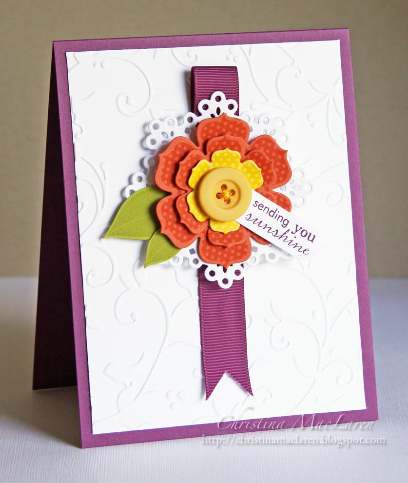
For my card, it started with the Beautiful Blooms II dies and stamps, which I used to make a layered flower in Tangerine and Daffodil. I added two Simply Chartreuse leaves and a hand trimmed tag stamped with a sentiment from PTI's Tag-its #3. The flower is adhered to a die cut doily and popped up on foam dots over a loop of Razzleberry grosgrain ribbon.
For the card base, I embossed a white cardstock panel with a Cuttlebug folder and adhered it to a Razzleberry card base.
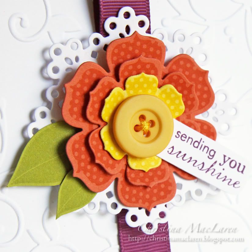
Cardstock: Stampin' Up! (Rich Razzleberry, Tangerine Tango, Daffodil Delight), Papertrey Ink (Simply Chartreuse, white)
Stamps: Papertrey Ink (Beautiful Blooms II, Tag-its #3)
Ink: Stampin' Up! (Rich Razzleberry, Tangerine Tango), Versarmark, Studio G (yellow)
Tools: Papertrey Ink (flower & leaf dies, doily die), ProvoCraft (embossing folder)
Accessories: Stampin' Up! (ribbon), button, DMC floss
I hope you'll play along with us this week! I'm looking forward to seeing how everyone tackles this challenge.
Thanks for stopping by today!


16 comments:
LOVE it Christina! LOVE! You have a knack for putting the colors together on a card and this is just fabulous!
This flower sings to me! WOW! I love it centered on the white doily! This is gorgeous Christina!!
Great way to use those bright colours! Love the pop of colour in the middle of all that white space :)
I'll say - SUNSHINE captured ON a card! What a juicy piece of FABULOUSNESS, Christina! BEEEEEAUTIFUL!!!!!
Simply Beautiful! Love the flower with the pop of purplish ribbon behind it.
Ooh such a pretty card! Not one of the colors overpower the other!
Wonderful CAS card. Love that flower and all its elements. ;)
Oh...those bright colors just make me smile! Gorgeous on the white background.
You really got a home run with this fun card! I love the way you put the colors together without making it too "loud". Awesome!!!
This is GORGEOUS, Christina! Those bright colors are scaring me a bit, but you've put them together so eloquently! Just Stunning!
I was feeling challenged by these colors, but as usual you used them perfectly! They look so sophisticated, but mine were looking childish. You are really and inspiration.
Oh yeah, and Suzanne and I decided that next year you HAVE to try out for the PC Idol competition!
Lovely lovely! So fresh and bright Christina! :) Love the pop of color against the white!
Love all the white space--perfect way to tackle these crazy bright colors AND make them pop! Great card, my friend!
this card is beautiful, Christina. I just pinned it. That doily die adds so much to it, and that daffodil delight flower and button in front of the two layers of TT flowers - well, it all just makes me happy. Thanks also for your sweet comment on my card. As always, it made my day. Hugs.
WOWZERS!!!!! This knocks my socks off, girl!!! The colors, that yummy layered flower, the embossing!!!! Every detail is PERFECT!!!! AMAZING work!
GASP! Holy frejoles!!! WOW!!! LOVE this girl! I've put off getting this stamp set and dies long enough! WOWZAS! I am in awe, friend!
Post a Comment