Today we are previewing one more stamp set and its coordinating die:
Written on Ribbon
Written on Ribbon companion die
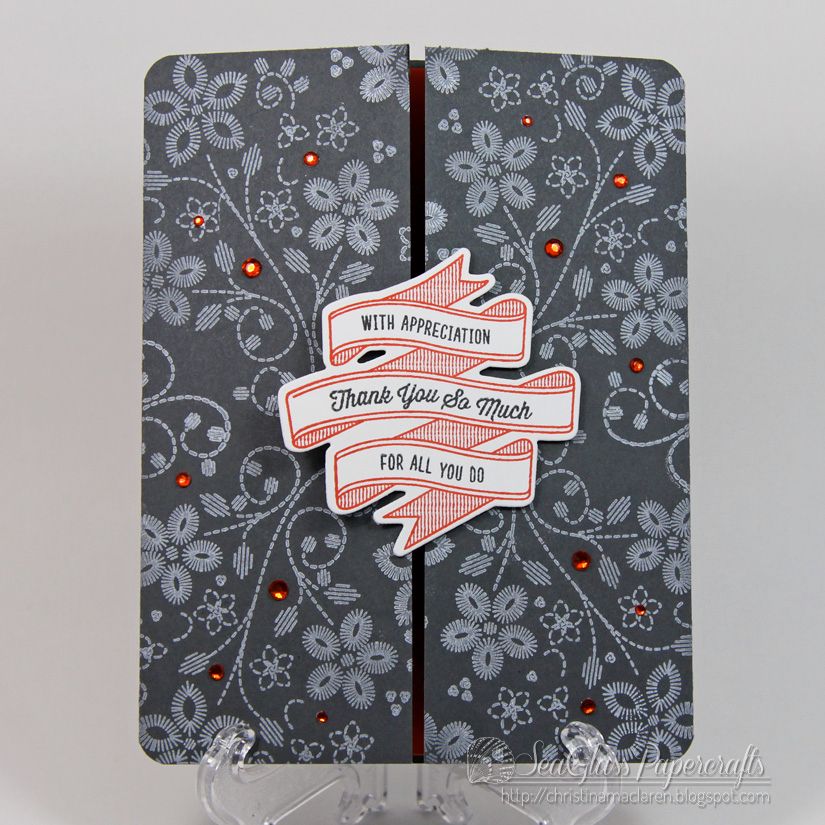
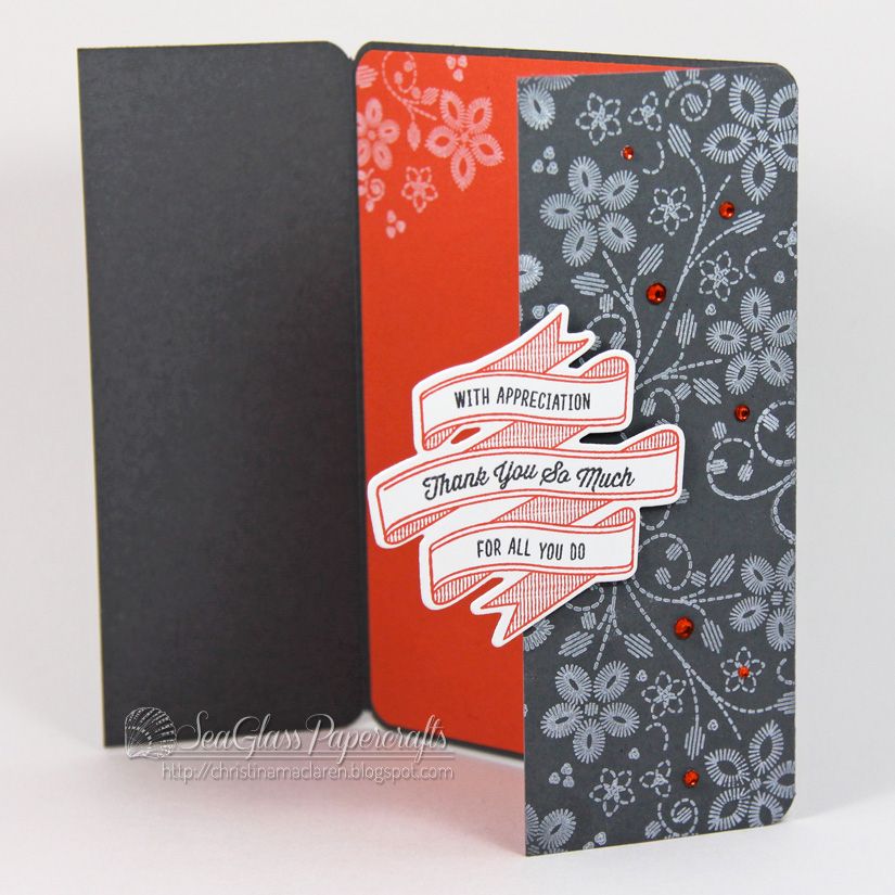
Written on Ribbon has a beautiful folded banner image and tons of sentiments for weddings, birthdays, and more. For my first sample, I made a gate-fold card with the die cut banner right in the center.
I just can't get enough of this new white ink, so I used it to stamp images from Embroidered Bouquet onto dark gray cardstock. Love!
The banner and gems look orange, but they are SU's Calypso Coral. I'm a bit smitten with this gray and coral color combo at the moment.
Cardstock: Stampin' Up! (Basic Gray, Calypso Coral), WPlus9 Design Studio (White)
Stamps: WPlus9 Design Studio (Embroidered Bouquet, Written on Ribbon)
Ink: WPlus9 Design Studio (White), Stampin' Up! (Calypso Coral, Basic Gray), Copic marker
Tools: WPlus9 Design Studio (Written on Ribbon die), We R Memory Keepers (Corner Chomper)
Accessories: Michaels (rhinestones)
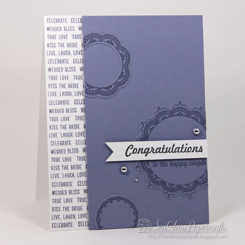
For my second card, I wanted to use the small sentiments from Written on Ribbon in a different way, so I lined up several wedding-themed phrases on a block and stamped them down the edge of a white card base.
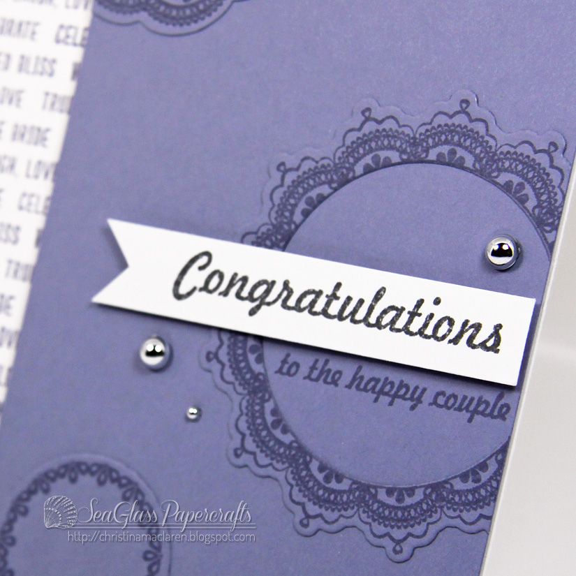
I stamped and die cut images from Lacey Layers and adhered them to a lavender panel, which is popped up with foam tape. I chose a focal sentiment from Heartfelt Mix, stamping "congratulations" on a white banner and "to the happy couple" below it.
Cardstock: Stampin' Up! (Wisteria Wonder), WPlus9 Design Studio (White)
Stamps: WPlus9 Design Studio (Written on Ribbon, Lacey Layers, Heartfelt Mix)
Ink: Stampin' Up! (Wisteria Wonder, Basic Gray)
Tools: WPlus9 Design Studio (Lacey Layers dies)
Accessories: Michaels (silver pearls)
Once again, you won't want to miss the creations from the WPlus9 Design Team:
Thanks so much for your comments and support! Be sure to stop by tomorrow for the full reveal of all the new sets!


21 comments:
These are both really pretty!! I love the jewels & pearls you've used on both of them!!
FABULOUS cards, Christina!! You did such an AWESOME job showcasing the vesatility of this set!!!! LOVE that sentiment strip you created on your second card!!!
Nice!!! i love the gate-fold one.... beautifully stamped!
My first thought when I saw your first card.... that is good coverage! I can't wait to get my hands on the new inks. I've been wanting a good white ink for some time.
Christina, up to your usual standard - brilliant. Congratulations on you guest DT spot. Knew it would come - maybe permanent in future!!!
I'm so glad to be the first to comment! I'm sure it will be the first of many. Oh, boy. Where do I start? The gate fold card is absolutely brilliant. This set is absolutely perfect for that! LOVE the colors as well and the rhinestone and pearl placement on both cards is awesome...I always have trouble with that. And I love everything on your second card as well...the paper you created with the sentiments, the layout, the die cuts adhered to the panel to add a bit of extra dimension. Ahh...so inspired by this post!
I can see why you're using the white ink...it looks amazing. Love how you decorated the inside of the card too!
Again...
perfectly gorgeous!
on both counts...
love them! :)
Oh, WOW! As much as I like the new ribbon die and stamps, I'm totally in awe by that background. It's gorgeous! That white ink looks fabulous on the grey cardstock!
Beautifully done, Christina! Just LOVE the flowers in the BG on the first card. Fun ribbon image too. Lovely doilies on the second and nice touch with the script on the left panel.
They so made a good call having you as guest designer Christina! Your projects again today are so beautiful and creative!
Amazing cards! I especially love the purple one!
Christina, this is just so beautiful. I that ribbon with writing, so amazing on this card and then to open it up and see that stunning red, love it!
love the gate fold card ... that die is really wonderful.
thanks for the inspiration!
Sandra ltb
Love them both, but that first card is absolutely stunning!
Wow this is GORGEOUS! I love how you used the typography. Seriously one of my fave cards of the release!!
Both of these are amazing Christina, but I really love that second one, just clever use of color and dies!
Perfection! Gorgeous colors, and I adore the background you stamped with the words on your second card!
LOVE the fold on that first beauty, and the color of the second... Swoon! Such an elegant, modern, graphic feel! Stunning!
So bold to stamp the white on the black card stock - worth the chance and wow! it packs a visual punch! Love it!
These are absolutely brilliant! I especially LOVE that you made that "door" card! I have to try that next time! :)
Beautiful Christina! The gray/red combo for your first card is amazing! And you make that background stamping look so easy (and gorgeous)!
The second card is more subtle but just as stunning! Purple is such an underused color:). The tone-on-tone stamping is so elegant. And the custom text background? Just perfect!
Hope you and the gang are keeping safe and warm today!
Post a Comment